Use this template to create a report that compares before and after, or other conditions for a new operational or capital improvement project or program, major event or other situations to ascertain improvements (or impacts) to a roadway’s performance.
Overview
Click to download the PowerPoint template to create a report that describes the performance of a roadway before and after an improvement or event. Additional design resources are also available.
We've strived to make the Guides simple and easy to understand, but if you have any questions or need help, please contact us at support@ritis.org. To start off, we think these abbreviated Lessons Learned from FHWA's Performance Reporting Prototype Technical Report are very instructive and important to keep in mind:
Tailor report content and format to engage and inform your audience
Keep reports for the general public engaging and simple
Reserve greater complexity for professional transportation audience
Consider how the audience experiences transportation - the general public typically doesn't care about agency business process silos
Relevant, easy-to-understand graphics are likely to be shared
‟Single issue, single page” graphics-heavy infographics are a valuable tool to draw in a larger audience
Snapshots are not enough
Make sure to include trends and contextual information
Link to actions being taken by the organization
Don't empasize appearance over effectiveness
Information should be conveyed clearly and concisely
Simplicity over embellishment is usually best
Tell a story so the data comes alive
The story must be delivered at the right technical level for the audience and targeted on an area of interest
Tips and Tricks (▶)
Throughout the How-to Guide, you’ll see lightbulb icons and blue arrow bullets. Click on the bulb icon to see tips on using PowerPoint features and functions to help make creating a report faster and better. Blue arrow bullets call out helpful information about building the report using RITIS and/or agency information.
How to Create the Report
Click on each numbered box below to learn how to create the content in each section and how we used RITIS to generate charts and produce performance data.
How to make the cover pages
Select cover page
In Microsoft PowerPoint open the front cover template.
Gather your agency's logo and some applicable background images to choose from.
Tip
Using high-resolution images will give your report a more professional look. If desired, choose some images that you can use as a banner photo for the Background / Summary page for Step 2.
Insert the logo and image
Copy and paste your image and agency logo into the cover page template.
Right-click on the image and select "Send to Back" from the drop-down menu so the image lays behind the cover graphics and text.
If there's not enough contrast with the background image, double-click your agency's logo and select Color from the Adjust ribbon to select a more suitable color.
Apply the finishing touches
Edit the Project Name / Description, date and report type placeholders.
You can change the colors of the bottom graphic by double-clicking it and selecting "Color" from the "Picture Format" ribbon.
Create a back cover
For the back cover, use the back cover template to add your agency's logo, a pertinent photo and contact info.
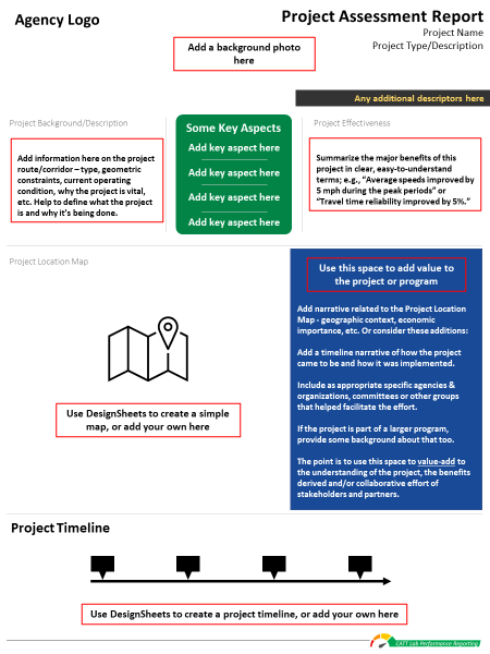
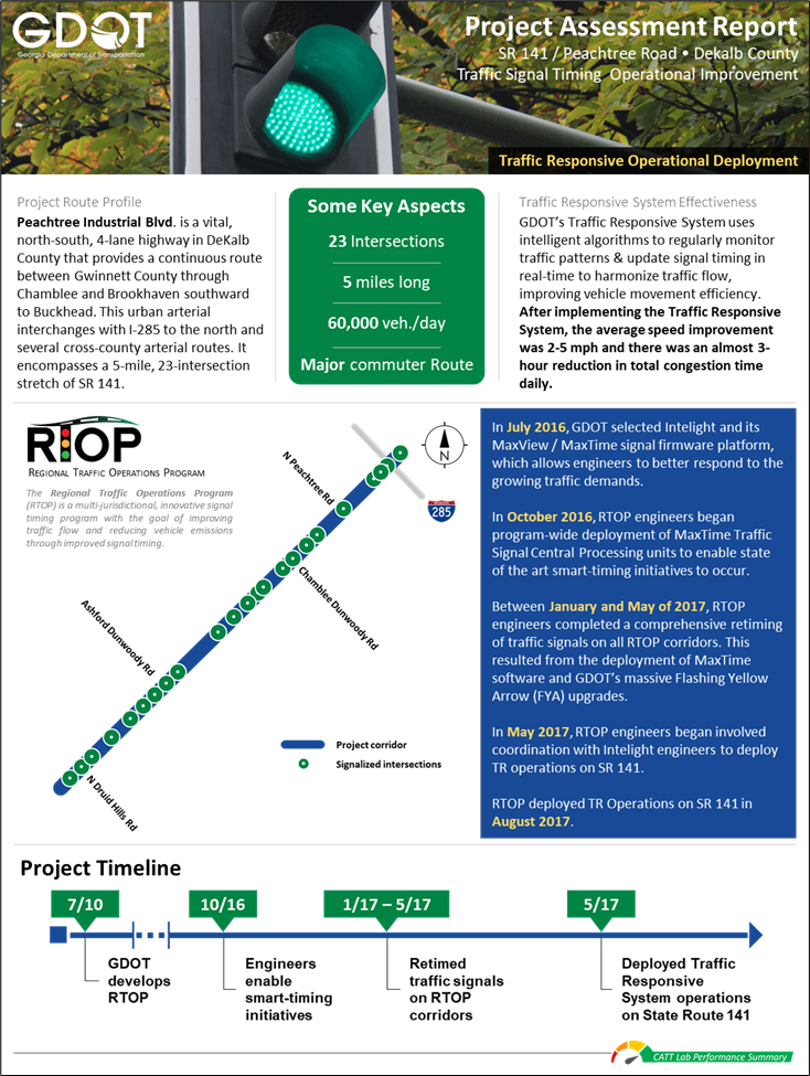
How to make the project background/summary page
Select Background/Summary page
In Microsoft PowerPoint open the Background / Summary page template.
Download the DesignSheets
Click on the "Download Design Resources" button (login required) at the top of this page to download the DesignSheet packet.
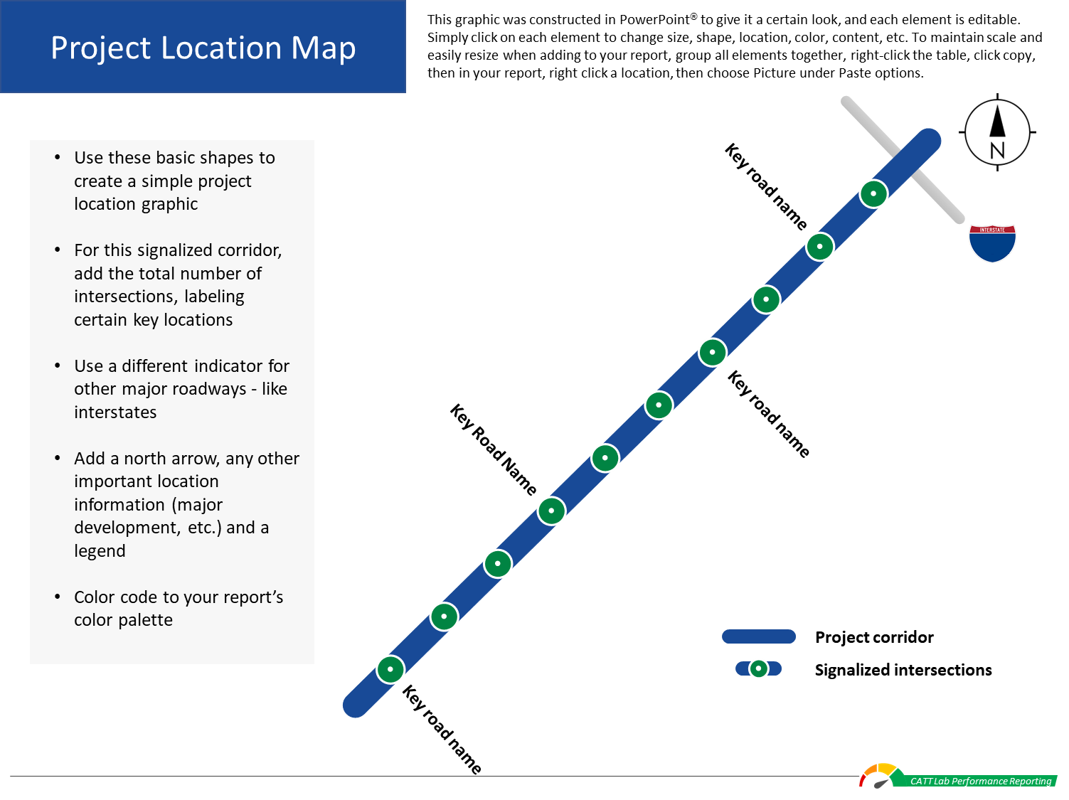
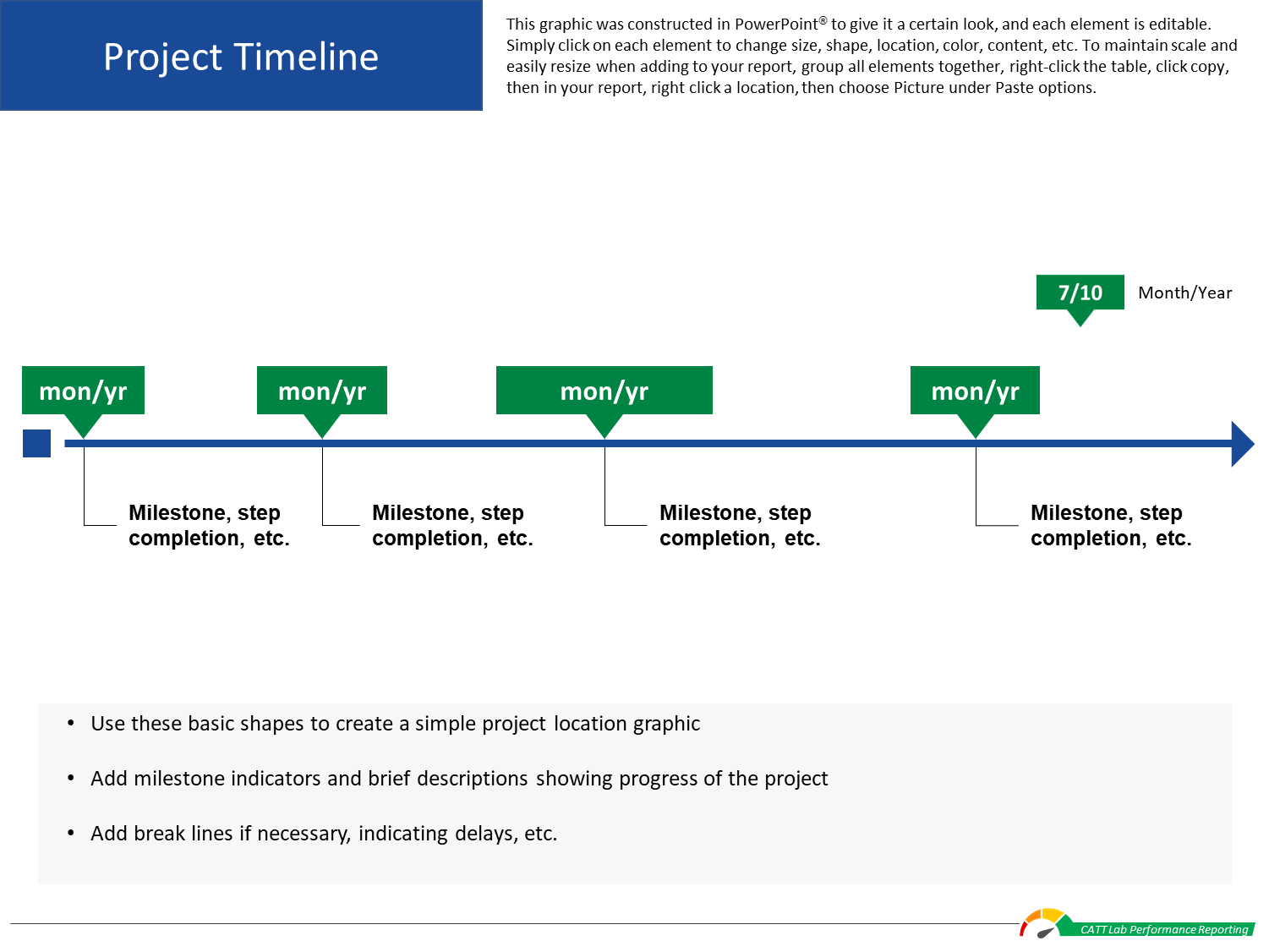
Open the Project Location Map and Project Timeline sheets.
Edit the graphics to suit your needs or use your own graphics or images.
Copy and paste your completed graphics into the template.
Tip
Copy and paste the finished graphic or table as a picture - this makes it easier to maintain scale and aspect ratio if you resize an image or table to fit your report.
Add the finishing touches
Edit the template placeholders to add this suggested content, or choose your own information to complete this report section:
For the header - provide some basic information and visuals for your report
For the Project Route Profile - describe the project route and/or why the project is being done
For the Project Route Details - add a few key aspects important to understanding the project, such as number of intersections or geographic context
For the Project Location Map / Narrative Box - provide details of the project prioritization process, timeline or partner collaborative efforts that aided in realizing the project
For the Project Timeline - provide a project roadmap summary over time that includes key dates, milestones, delays and accomplishments
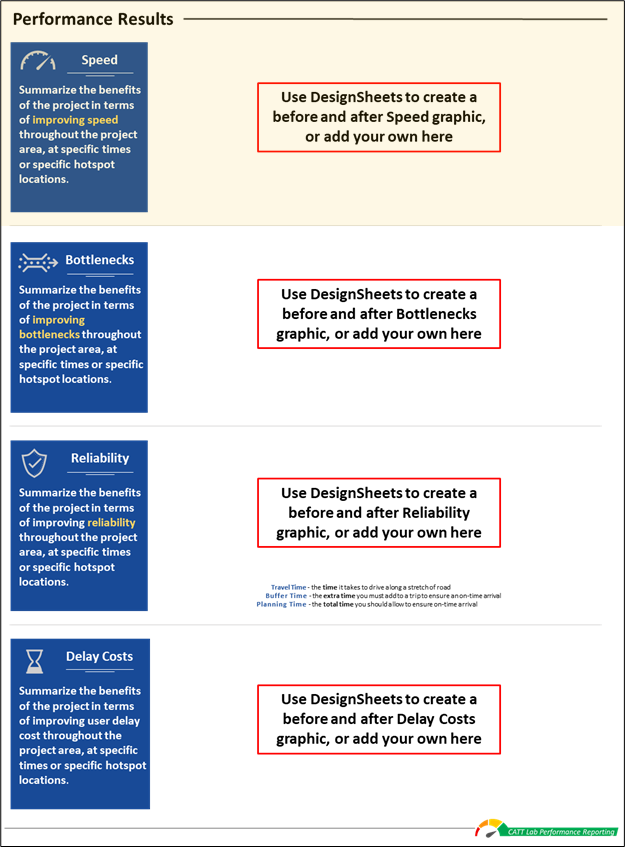
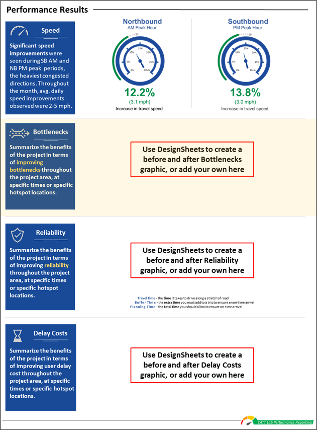
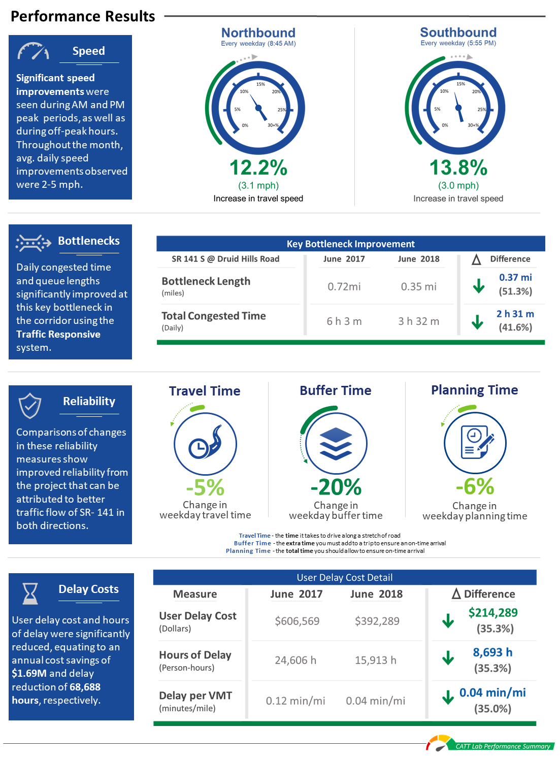
How to make the performance results page (speed graphics)
Select the performance results page template
In Microsoft PowerPoint open the Performance Results page template.
Open the speed chart DesignSheets
Click on the "Download Design Resources" button (login required) at the top of this page to download the DesignSheet packet.
Open the speed chart sheets.
Once you've summarized your results, use this design resource to create custom graphics for your report.
You can then copy and paste your completed graphics into the template.
Tip
Copy and paste the finished graphic or table as a picture - this makes it easier to maintain scale and aspect ratio if you resize an image or table to fit your report.
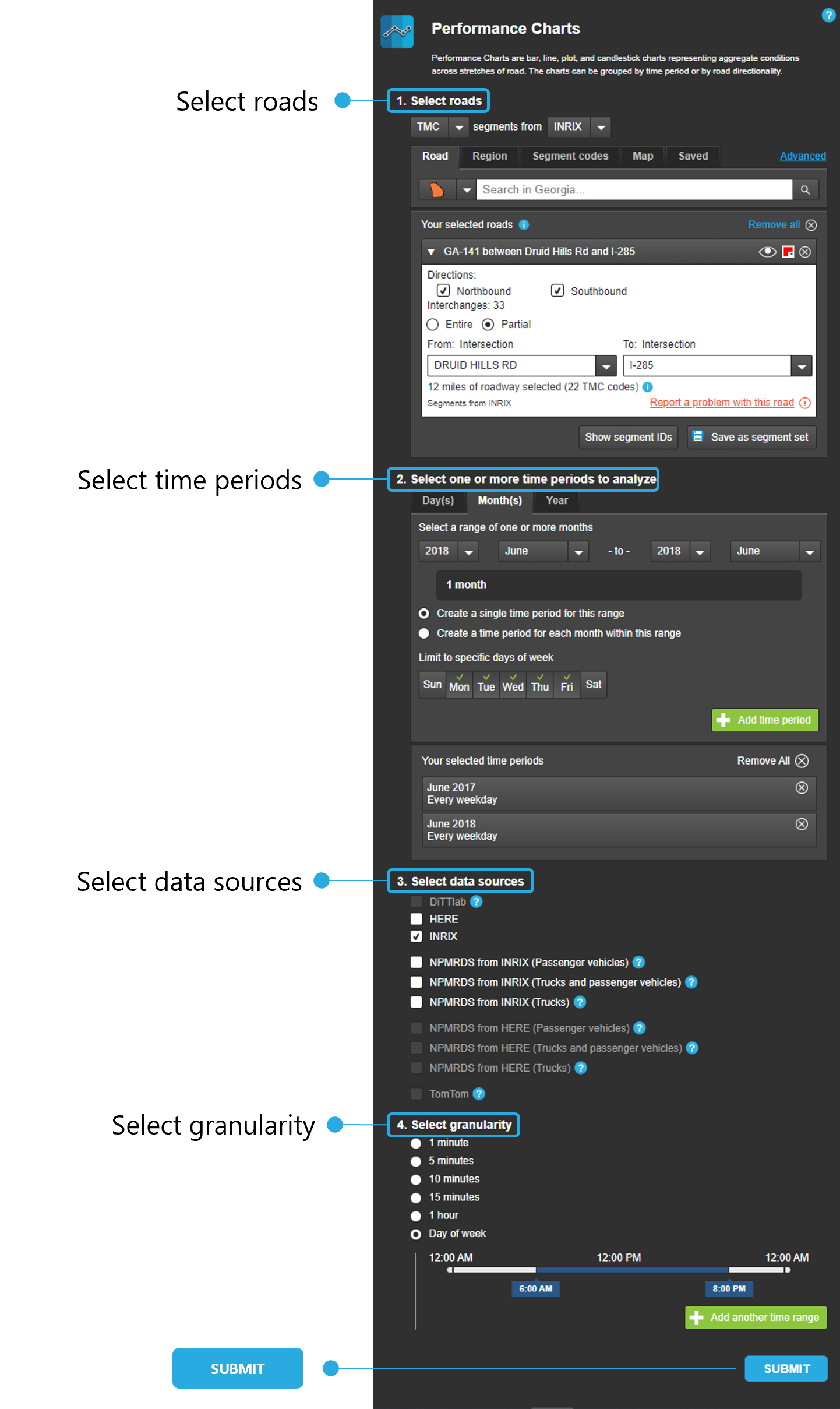
Open the Performance Charts tool and use the query screen to define the parameters of your search:
Select roads - choose your state, then in the search bar type the name of your road.
Tip
Saving the roads you've chosen in the Select Roads step will save you time and effort - once you've selected all your roads, simply click on the "Save as Segment Set" button and then choose a name. Then the next time you want to use this set, choose the "Saved" tab under Select Roads and click on your desired segment set.
Select time periods - choose the day(s), month(s) or year you wish to analyze, then choose time periods for the range as well as days of the week. Add the time period by clicking on the green button. Repeat the process for each analysis time period.
Select data sources - choose your agency's data source or use the NPMRDS datasets.
Select granularity - choose the fineness of the data (1 minute to 1 hour) or choose a specific time range (Day of week). Add another time range by clicking on the green button, then repeat the process.
Submit - once you're satisfied with your query inputs, click the SUBMIT button.
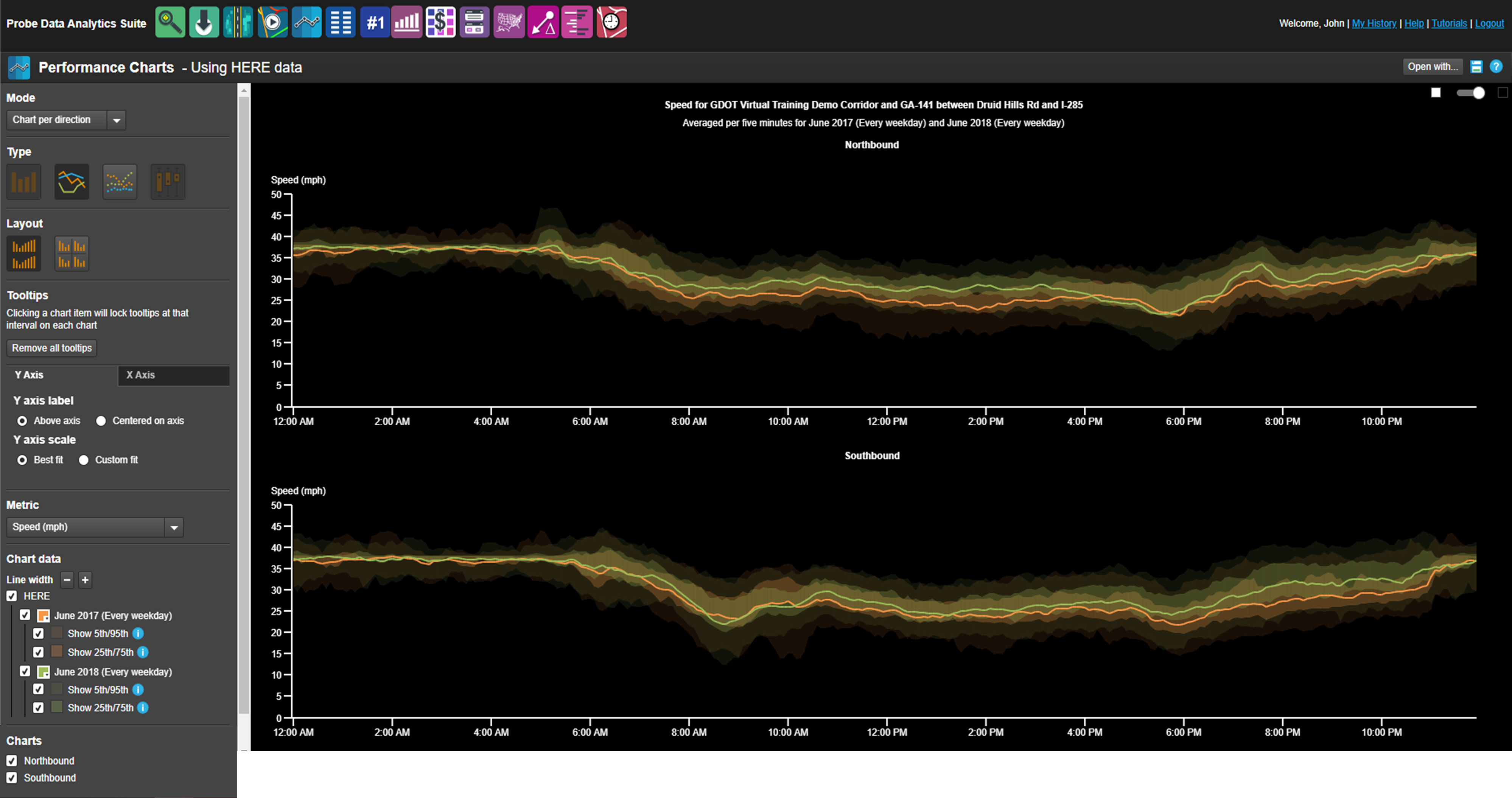
Your results will look something like this
The results page has two parts: a Control Panel on the left and the charted results on the right.
Use the Control Panel to change the chart type, axes look and information, select which metric to display, and adjust the color and size of the chart data.
Shown below are steps you can use to make the chart easier to read and more informative for your report.
Modify the chart for easier reading & use
In the upper right corner of the charts, drag the slide from night mode to day mode.
Under the Y Axis tab, select Custom fit, then choose the best fit range of speed - in this example, a min of 20mph and a max of 40mph.
Under the X Axis tab, select Custom fit, then choose the best fit range of time - in this example, from 6am to 9pm.
Under Chart data, click on the Line width "+" sign twice, to increase the line thickness, then deselect the checkboxes for the 5th/95th and 25th/75th percentile speed readings (for both years). Finally, click on the Color Palette boxes next to the dates, and choose a red (June 2017 - Before) and bolder green (June 2018 - After) color to help the lines stand out.
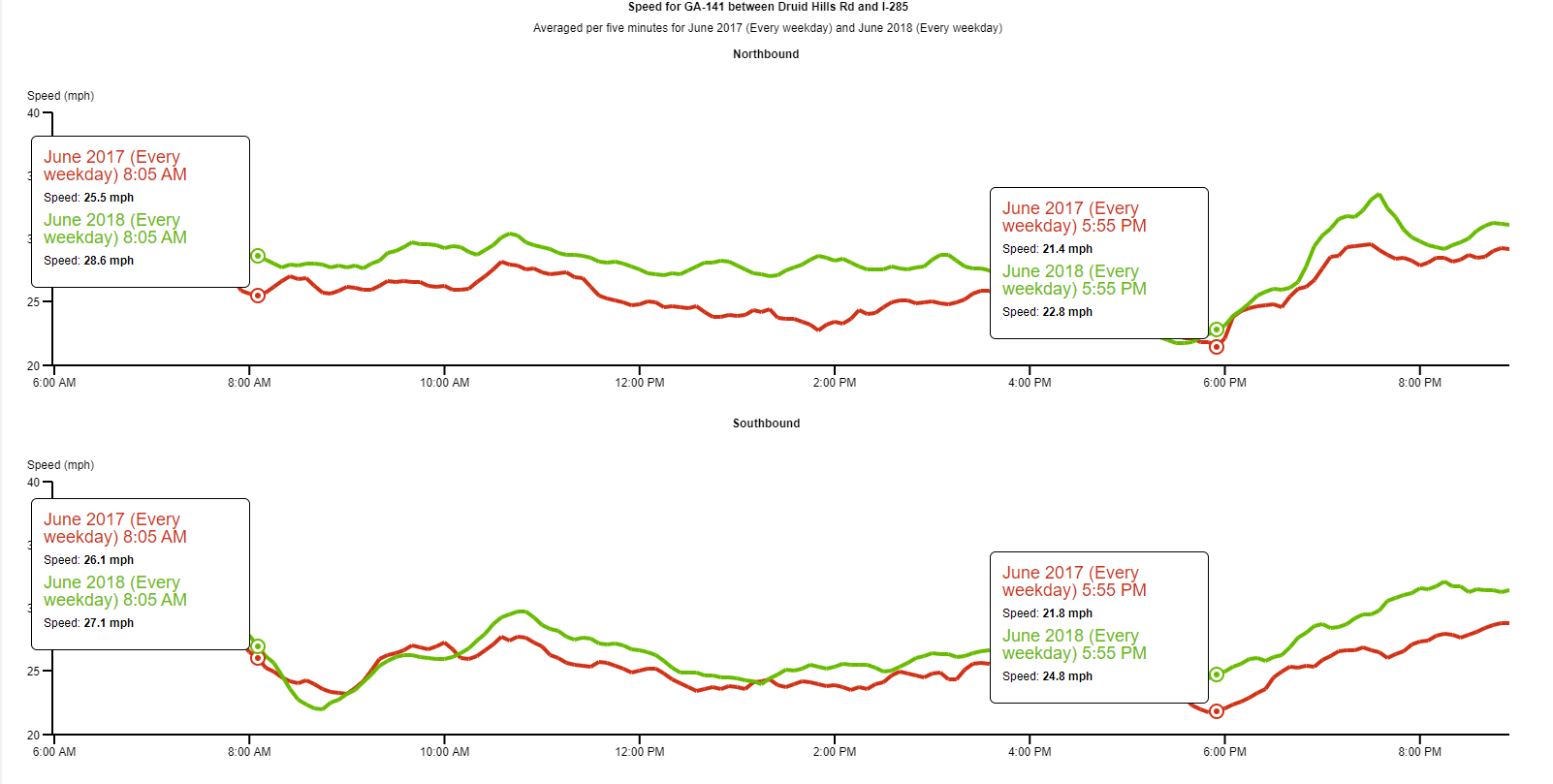
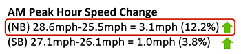
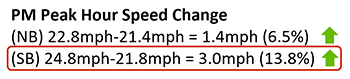
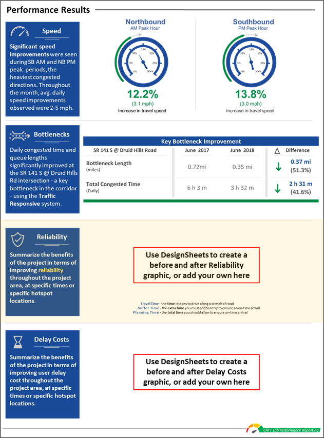
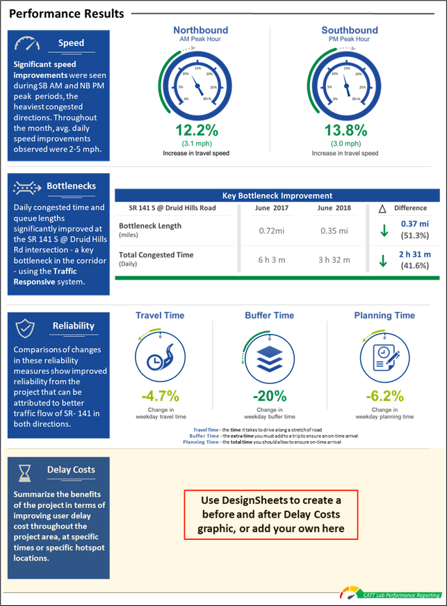
In this example, we hovered over the lines at 8:05 AM, clicked on the line to lock the tool-tip, then hovered over the lines at 5:55 PM and locked another tool-tip, showing the road's AM/PM peak hour speed differentials for June 2017 (Before) and June 2018 (After) conditions.
Tip
You can choose from 11 different metrics and 4 different chart types to present your results. Choose the ones best suited to your needs and use these charts directly or create summary results and use our custom graphics to help tell your story.
Calculate the changes in speed
Do a simple calculation of the speed changes before and after the project, in terms of whole numbers and percentages.
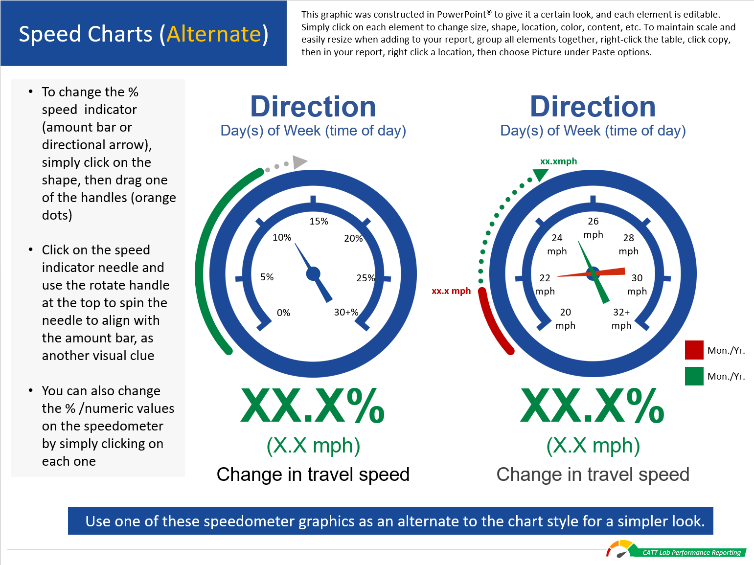
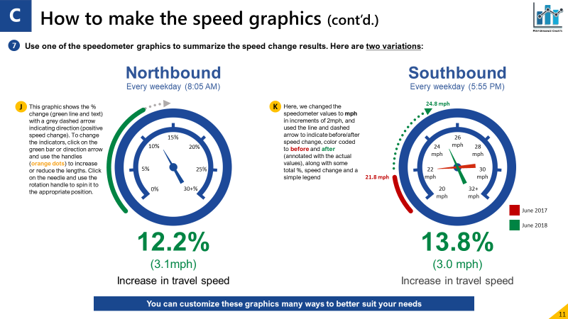
Use these results and incorporate them into the speedometer graphics, to present the speed improvement results (see below).
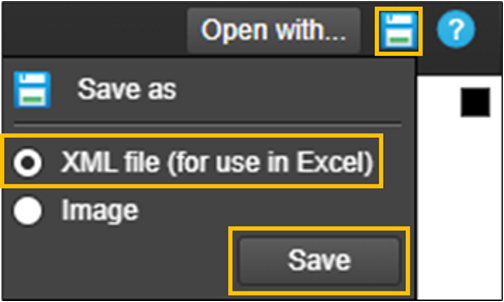
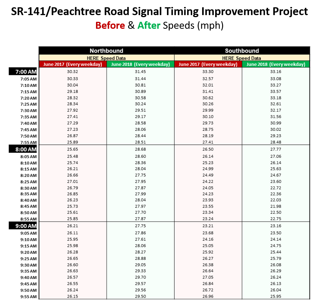
You can also download an XML file and use the detailed data for more rigorous analysis:
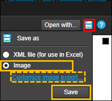
On the results page, click on the "Save as" icon, select XML file and click Save
Opening the file, the results will look something like the image on the left*
In Excel, you can make a few simple changes to the table - color-coding cells and headers, to make it easier to use
Present your results in graphic form
Using the Speed graphic DesignSheet, add your information. Each graphic has accompanying text to guide you in modifying graphic elements.
There are two variations of the graphic, and both are fully editable, so you can customize it many ways to better suit your needs.
Once you're satisfied with the results, simply copy and paste (as a picture) the graphic into your report, and in the blue box, add some text that summarizes the benefit of the improvement, or other important information.
Making an alternate line chart graphic
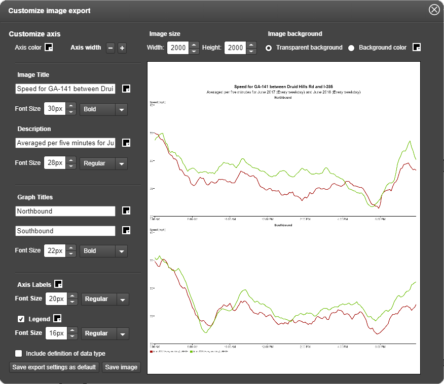
To make a line chart graphic, first save the speed charts by clicking on the "Save as" icon, then click Image, and "Customize image export..."
Use the Customize image export screen to adjust certain aspects of your graphics, like font size, labels and colors.
When you're satisfied with your choices, click "Save Image".
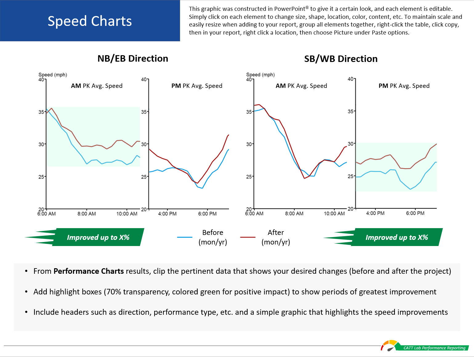
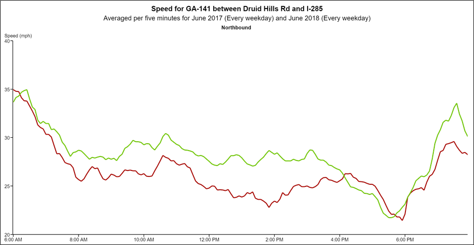
Your saved chart will look something like the one below. Use this chart to create smaller, more abbreviated charts that focus on the peak hours or periods your audiences would be most interested in.
To create an abbreviated chart, first crop the Speed chart to cover the AM peak period - say, from 6:00 AM to about 10:00 AM.
Then crop the PM peak period part of the chart - since you're cropping towards the end of the chart, there won't be a Y axis, so simply crop a copy of the chart to show just the axis, and carefully line it up with the cropped PM peak period chart.
Tip
When you want to align something very carefully (fine-grain movement) in PowerPoint, hold down the Alt key, and then click and move an object.
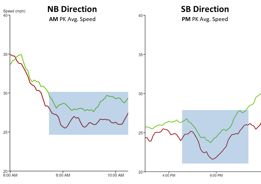
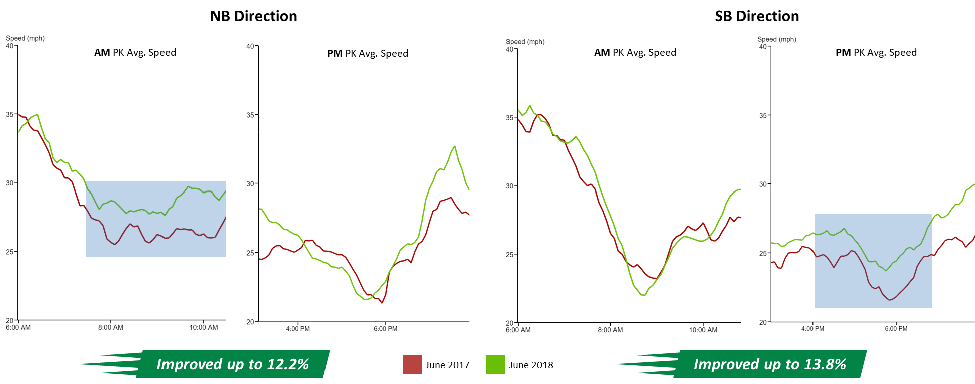
Add some header text and a colored highlight box to help readers focus in on the important parts of the graph.
Then add some simple summary graphics and a legend, and your speed graphic is complete.
How to make the performance results page (bottleneck table)
Select the Performance Results page
Open the template page you used to create the speed graphics.
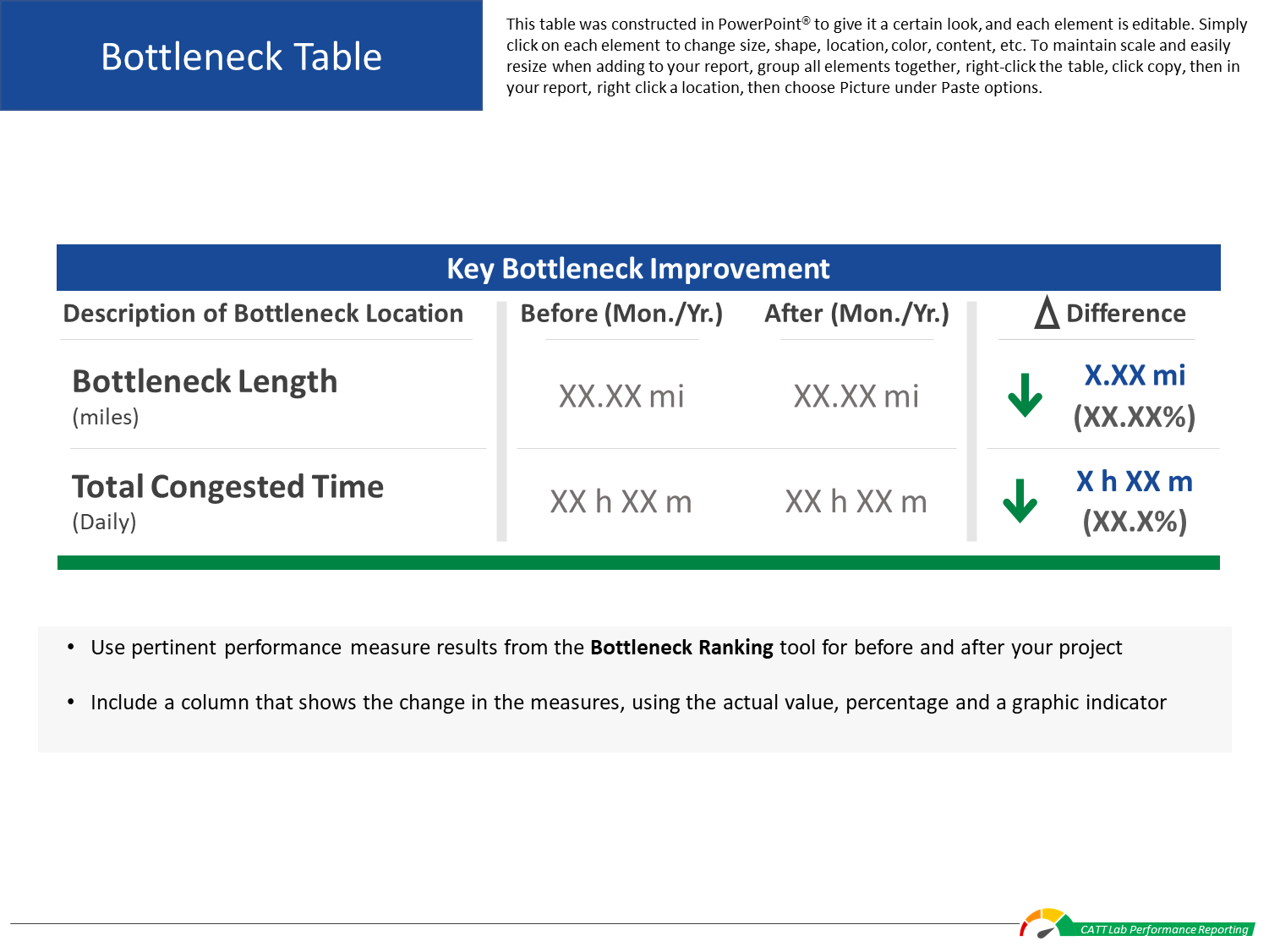
Open a bottleneck table DesignSheet
Click on the "Download Design Resources" button (login required) at the top of this page to download the DesignSheet packet.
Open the Bottleneck Table sheet.
Once you’ve summarized your results, use these design resource to create custom graphics for your report or use your own graphics or images.
You can then copy and paste your completed graphics into the template.
Tip
Copy and paste the finished graphic or table as a picture - this makes it easier to maintain scale and aspect ratio if you resize an image or table to fit your report.
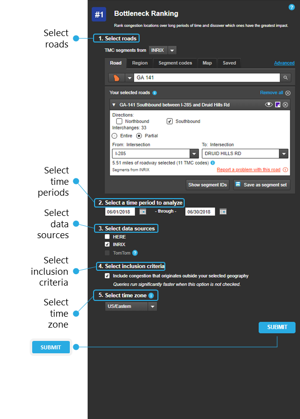
Using the Bottleneck Ranking query screen
Open Bottleneck Ranking and use the query screen to define the parameters of your search:
Select roads - choose your state, then in the search bar type the name of your road. Then select the direction (SB) and an Entire or Partial roadway (from intersection to intersection).
Tip
Saving the roads you’ve chosen in the Select Roads step will save you time and effort – once you’ve selected all your roads, simply click on the “Save as Segment Set” button and then choose a name. Then the next time you want to use this set, choose the “Saved” tab under Select Roads and click on your desired segment set.
Select time periods - choose the range of dates – the day(s), month(s) and year – for your analysis.
Select data sources - choose your agency’s data source.
Select inclusion criteria - check this box if you want to include congestion that originates outside of your selected geography.
Select time zone - choose one of the US time zones.
Submit - once you’re satisfied with your query inputs, click the SUBMIT button.
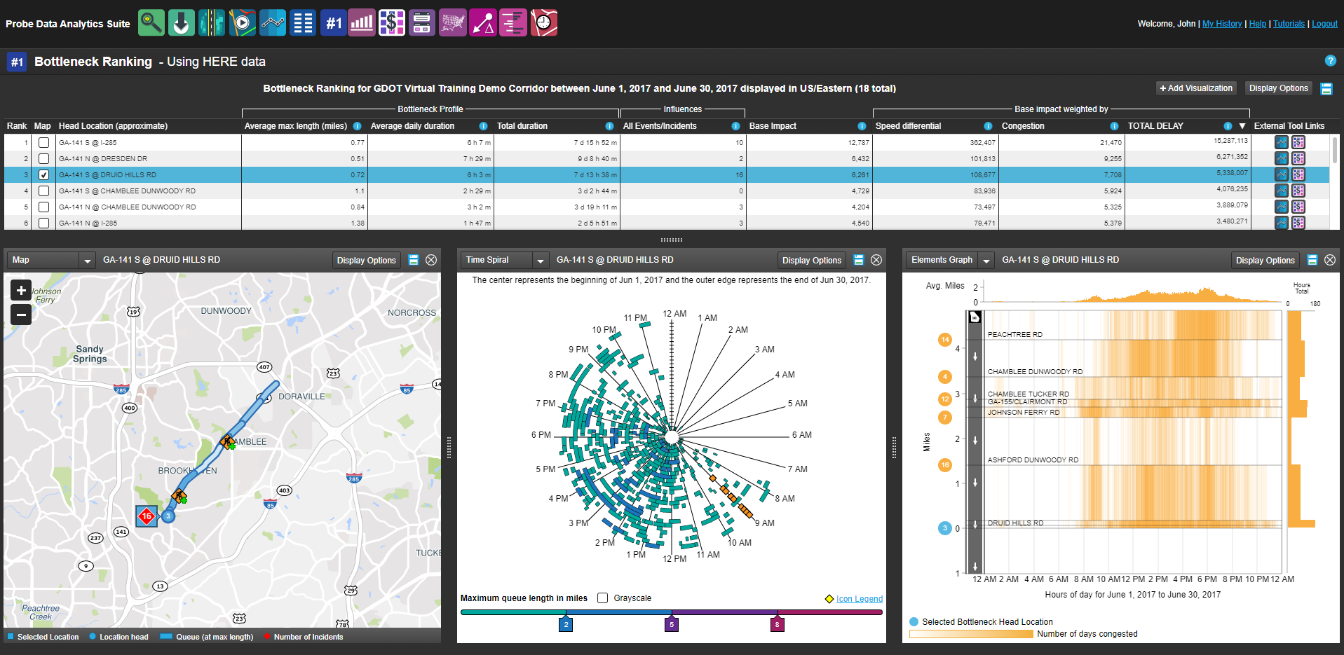
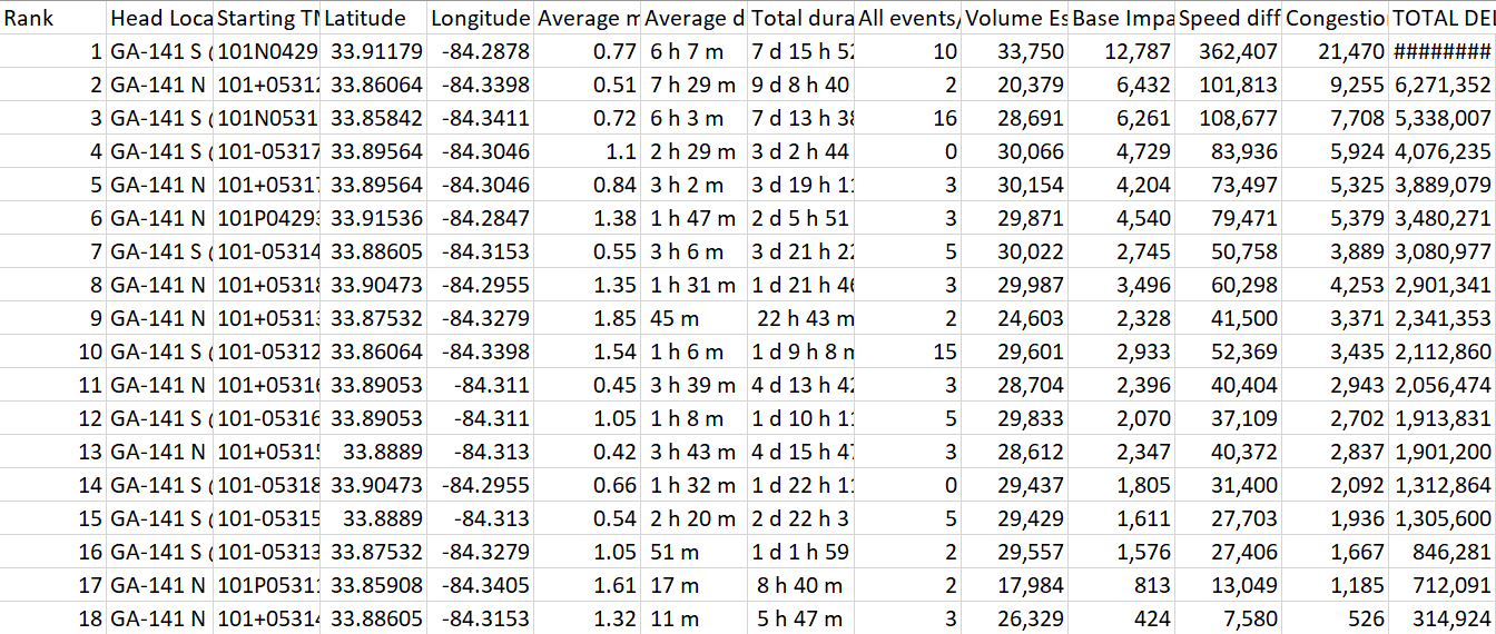
Your results will look something like this
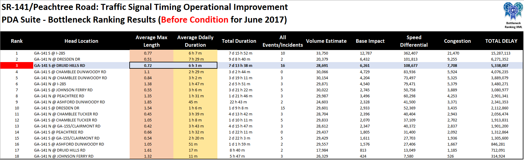
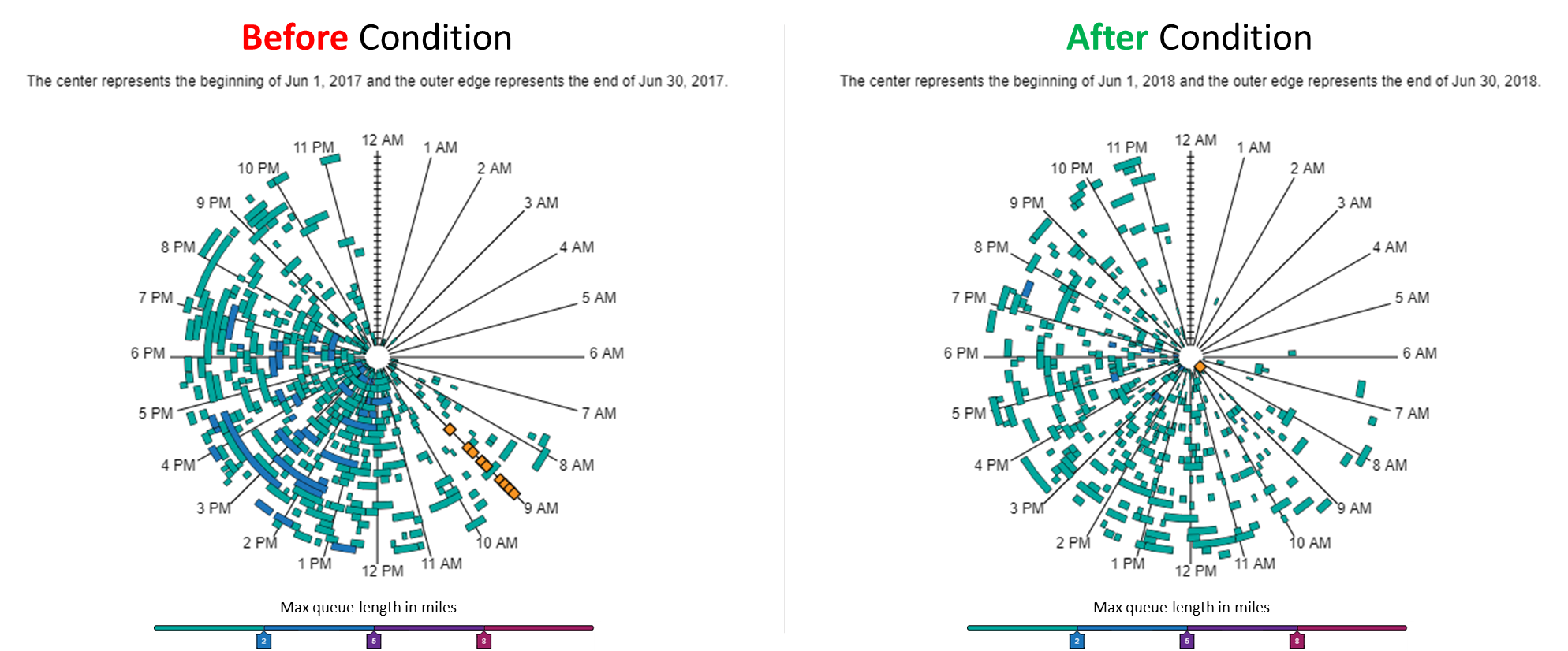
In the table, select a bottleneck location important in demonstrating project benefits – in this case, we selected GA-141 @ Druid Hills Rd.
Tip
To get additional analysis quickly for any bottleneck location, click on one of the tool icons (Performance Charts, User Delay Cost) under the External Tool Links header on the right side of the table.
You will see the widgets – in this case Map, Time Spiral, Elements Graph - update to the selected location. You can use this information directly to supplement your performance reporting document (example to follow) or use the provided table in the DesignSheet packet.
The table and each widget have Save icons – simply click on the icon to save the table as an Excel file or click on the graphics icons to save an image. For now, save the table.
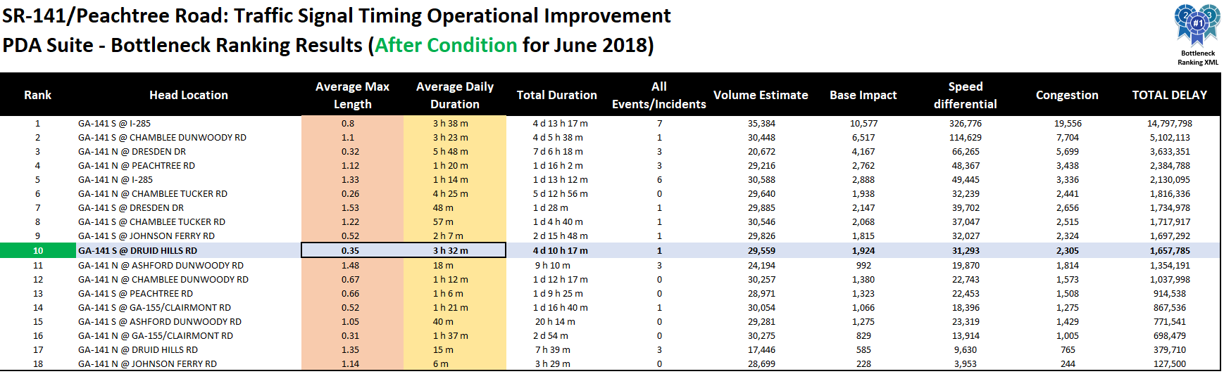
Your results will look something like this
Use some basic formatting features in Excel – such as cell fill or text color – to make the table more easily read.
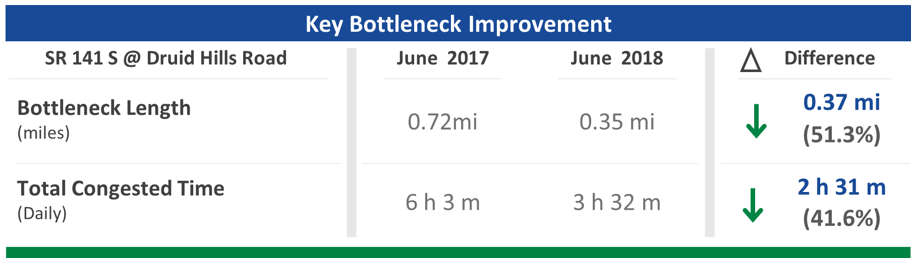
For our example, take the Average Max Length and Average Daily Duration values (GA-141 S @ Druid Hillis Rd), for the Before Condition (June 2017) and After Condition (June 2018), then determine the numeric and percent differences.
Open a bottleneck table DesignSheet
Using the Key Bottleneck Improvement table from the DesignSheets, add in the bottleneck performance information and numerical and percent changes from above.
Once you’re satisfied with the results, simply copy and paste (as a picture) the graphic into your report, and in the blue box, add some text that summarizes the benefit of the improvement, or other important information.
Tip
Copy and paste the finished graphic or table as a picture - this makes it easier to maintain scale and aspect ratio if you resize an image or table to fit your report.
Create an Optional Graphic
Another option is to use the visualizations directly from the tool to help tell your story. Here’s an example using Time Spiral.
Simply save the image for each condition (Before / After), add the images to a blank PowerPoint sheet and align them side by side. Add a header for each, then group everything together. Copy and paste the result into your report. In the blue box, add some text that summarizes significant aspects of bottleneck improvement, or other important information.
How to make the performance results page (reliability graphic)
Select the performance results page
Open the template page you used to add the previous speed / bottleneck results.
Open the reliability graphic DesignSheet
Click on the "Download Design Resources" button (login required) at the top of this page to download the DesignSheet packet.
Open the Reliability Graphics sheets.
Once you’ve summarized your results, use these design resource to create custom graphics for your report or use your own graphics or images.
You can then copy and paste your completed graphics into the template.
Tip
Copy and paste the finished graphic or table as a picture - this makes it easier to maintain scale and aspect ratio if you resize an image or table to fit your report.
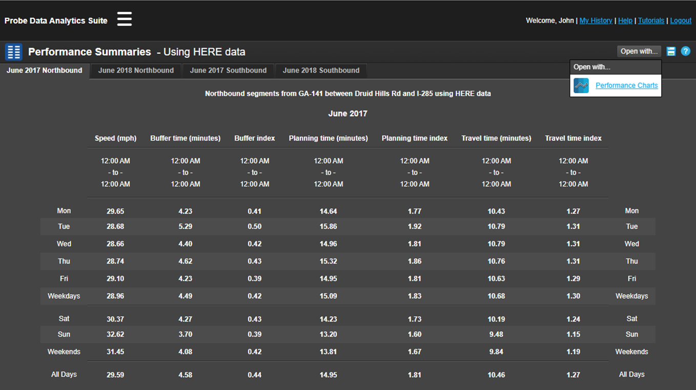
Using the Performance Summaries query screen
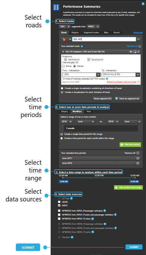
Open Performance Summaries and use the query screen to define the parameters of your search:
Select roads - choose your state, then in the search bar type the name of your road.
Select time periods - choose the day(s), month(s) or year you wish to analyze, then choose a time period display option for the range. Add the time period by clicking on the green button. Repeat the process for each analysis time period.
Select time range - select a time range to analyze within each time period by moving the sliders. Add the time period by clicking on the green button. Repeat the process for each analysis time range.
Select data sources - choose your agency’s data source or use the NPMRDS datasets.
Submit - once you’re satisfied with your query inputs, click the SUBMIT button.
Your results will look something like this
Review the information to populate the reliability graphics that best communicate the performance changes to your audience:
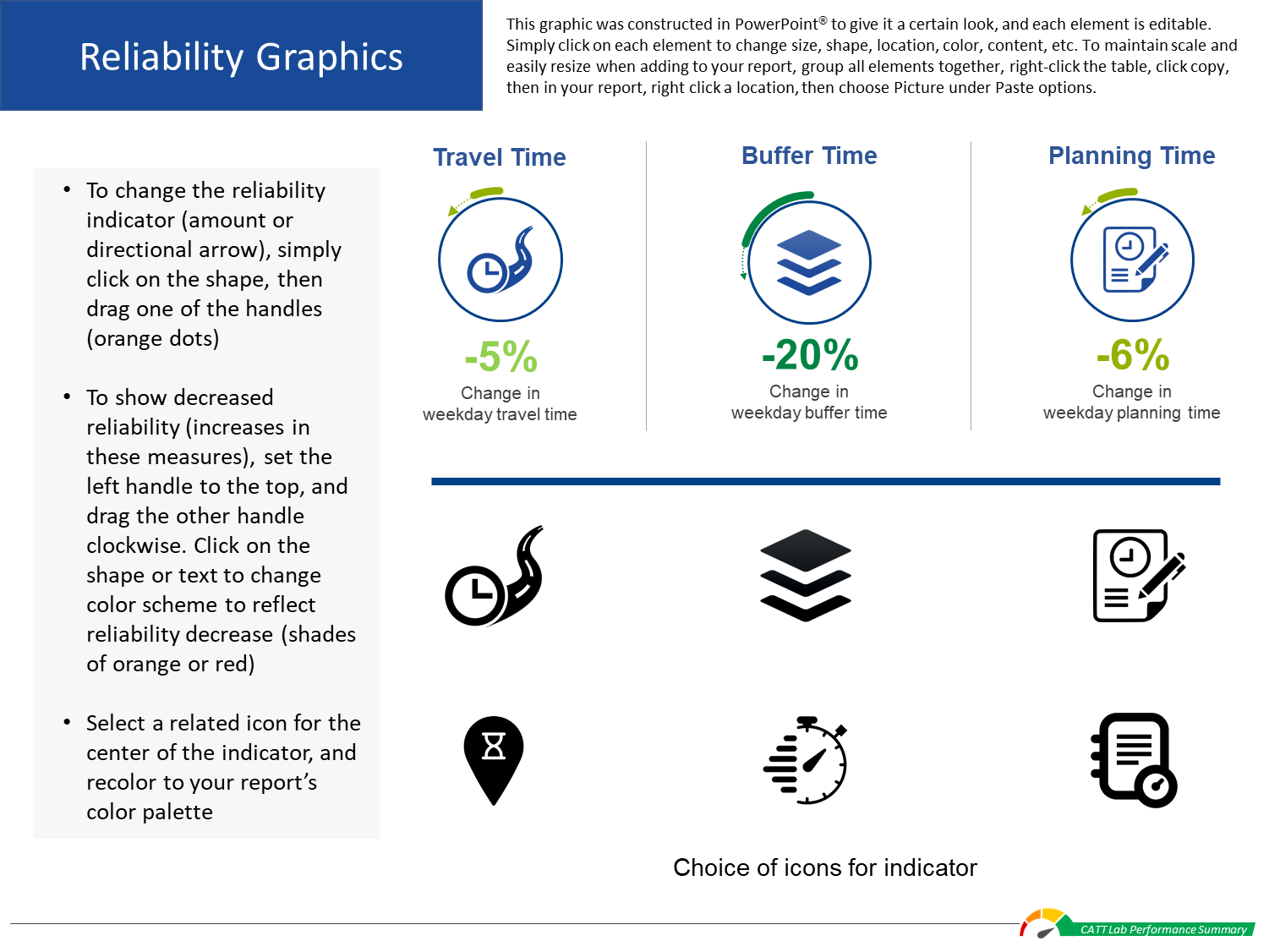
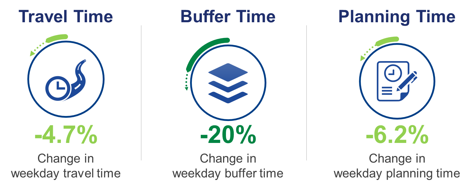
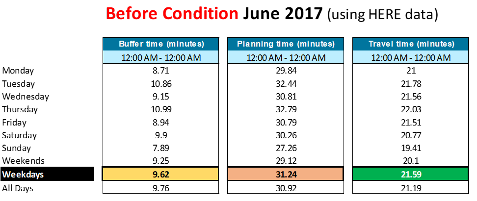
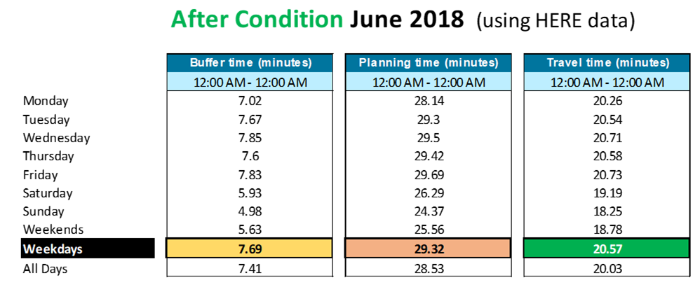
Review the performance measures to include in the report. For our example, we chose Buffer Time, Planning Time and Travel Time.
Then review the times and measure values you’d like to report. For this example, we chose those values for Weekdays.
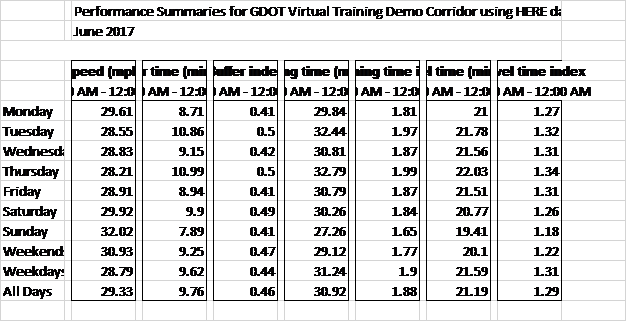
Save the table
On the results page, click on the Save as icon, select XML file and click Save.
Opening the file, the results will look something like the table shown left, top.
Use some basic formatting features in Excel – such as cell fill or text color – to make the table easier to read, like the table left, bottom.
Tip
To show only the performance summaries you’re interested in, You can either delete the columns you don’t want, or use the Hide feature in Excel to hide the metrics you’re not using, while still having them available, if needed.
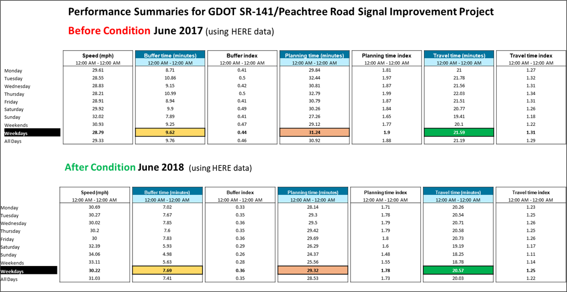
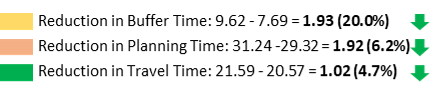
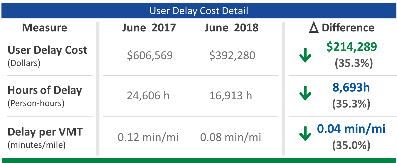
For our example, we’ve highlighted the desired metric results for the Before Condition (June 2017) and After Condition (June 2018), then determined the numeric and percent differences:
Open the reliability graphic DesignSheet
Using the reliability graphic DesignSheet, fill in the appropriate data for your selected metrics.
Make indicator adjustments (circular arrow and bar) for each measure by clicking on each shape, then click and hold the orange dots to resize them.
Copy and paste your finished graphic into your Performance Results report page.
Use an alternate graphic (results table)
You can use the edited tables created above as an alternate graphic.
Here, we’ve hidden the metrics we didn’t want, and added some simple summary bars at the bottom.
Copy and paste your finished graphic into your Performance Results report page.
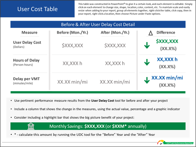
How to make the user delay cost table
Select the performance results page
Open the template page you used to add the previous performance results.
Open a user delay cost DesignSheet
Click on the "Download Design Resources" button (login required) at the top of this page to download the DesignSheet packet.
Open the User Cost Table sheets.
Once you’ve summarized your results, use these design resource to create custom graphics for your report or use your own graphics or images.
You can then copy and paste your completed graphics into the template.
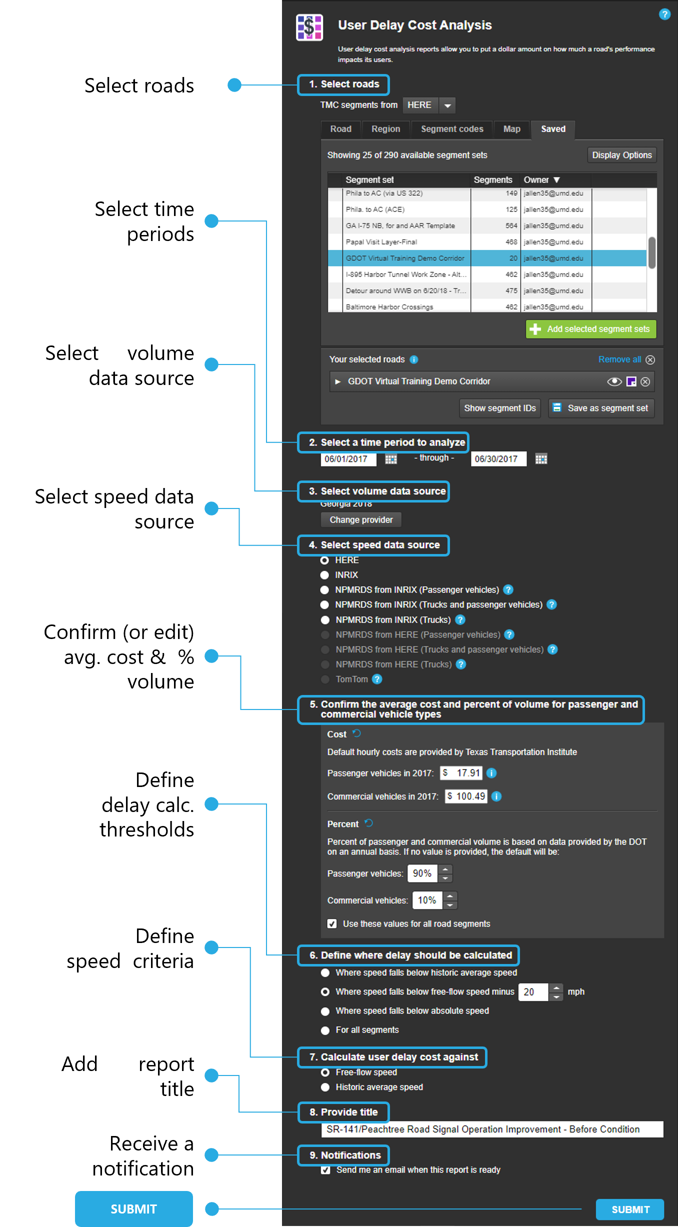
Using the User Delay Cost Analysis query screen
Open User Delay Cost and use the query screen to define the parameters of your search:
Select roads - choose your state, then in the search bar type the name of your road.
Select time periods - choose the day(s), month(s) and year you wish to analyze.
Select volume data source - select available data providers and add to a list. If volume data is not available for a given segment for your first selected provider, volume data for that segment will come from the next available provider and so on.
Select speed data source - select a data provider, including NPMRDS options.
Confirm the average cost and percent of volume for passenger and commercial vehicle types - use the default values shown or edit the inputs to your agency-generated values.
Define where delay should be calculated - choose an option for the tool to calculate delay.
Calculate user delay cost against - choose either Free-flow or historic average speed.
Provide a title - name your query using things like dates, roadway name and limits, condition, etc.
Submit - once you’re satisfied with your query inputs, click the SUBMIT button.
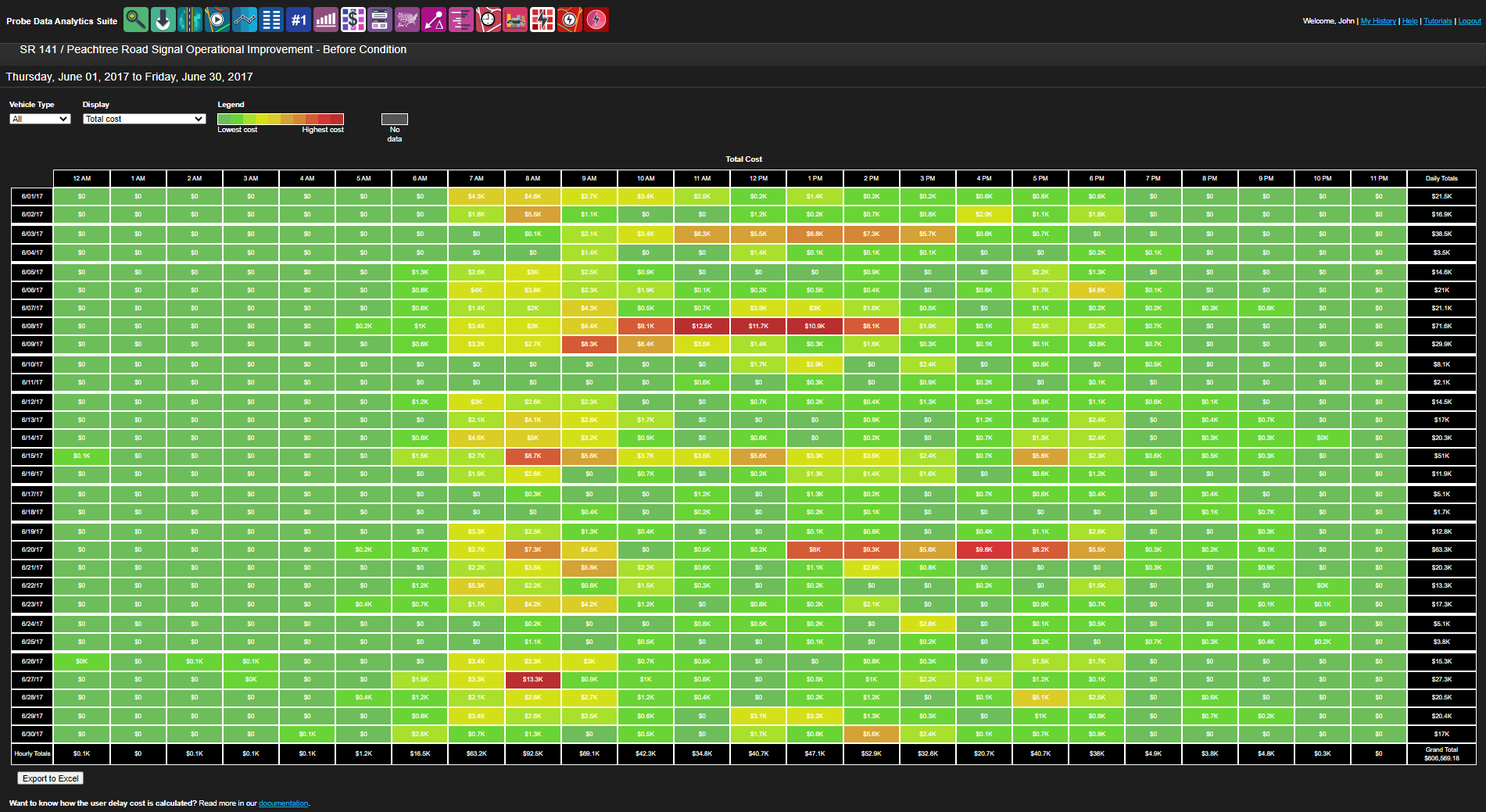
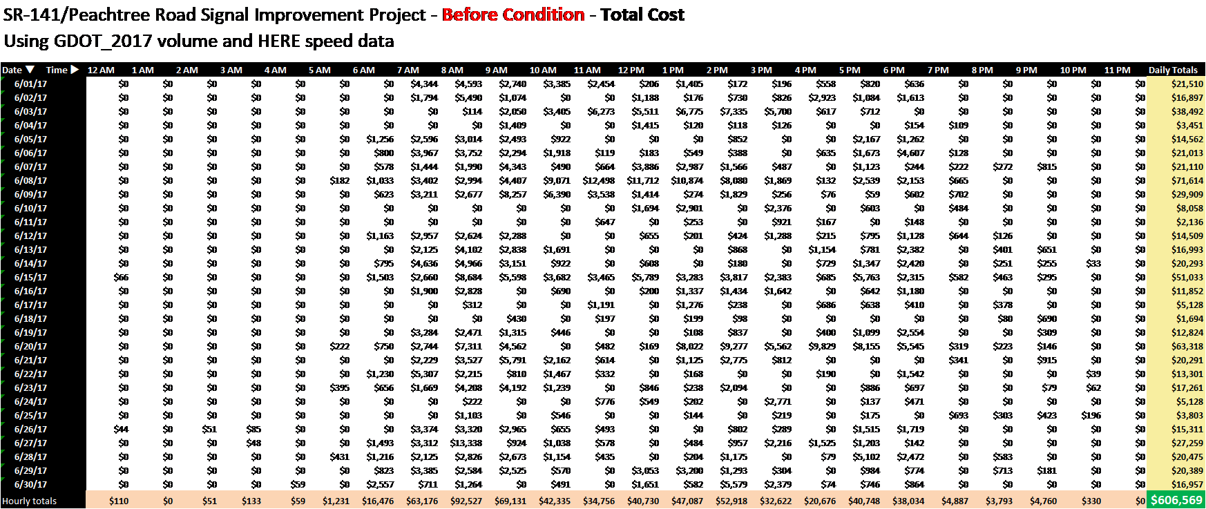
Your results will look something like this
To gather information to populate the UDC table, use these methods:
Use the dropdown menus to choose Vehicle Type, and/or Display to view several different performance measures in the table. Copy pertinent information, like the grand total for user delay cost.
Tip
You can choose from 6 different metrics and 3 different vehicle types to present your results. Choose the ones best suited to your needs and use our custom graphics to help tell your story.
Hover over any of the individual cells, or the summary cells to the right and bottom and see a pop-up of detailed information for that cell. Use this for selecting key data to tell your story.
Click on the "Export to Excel" button to download an entire table that contains all the available performance measure data, for detailed post-processing.
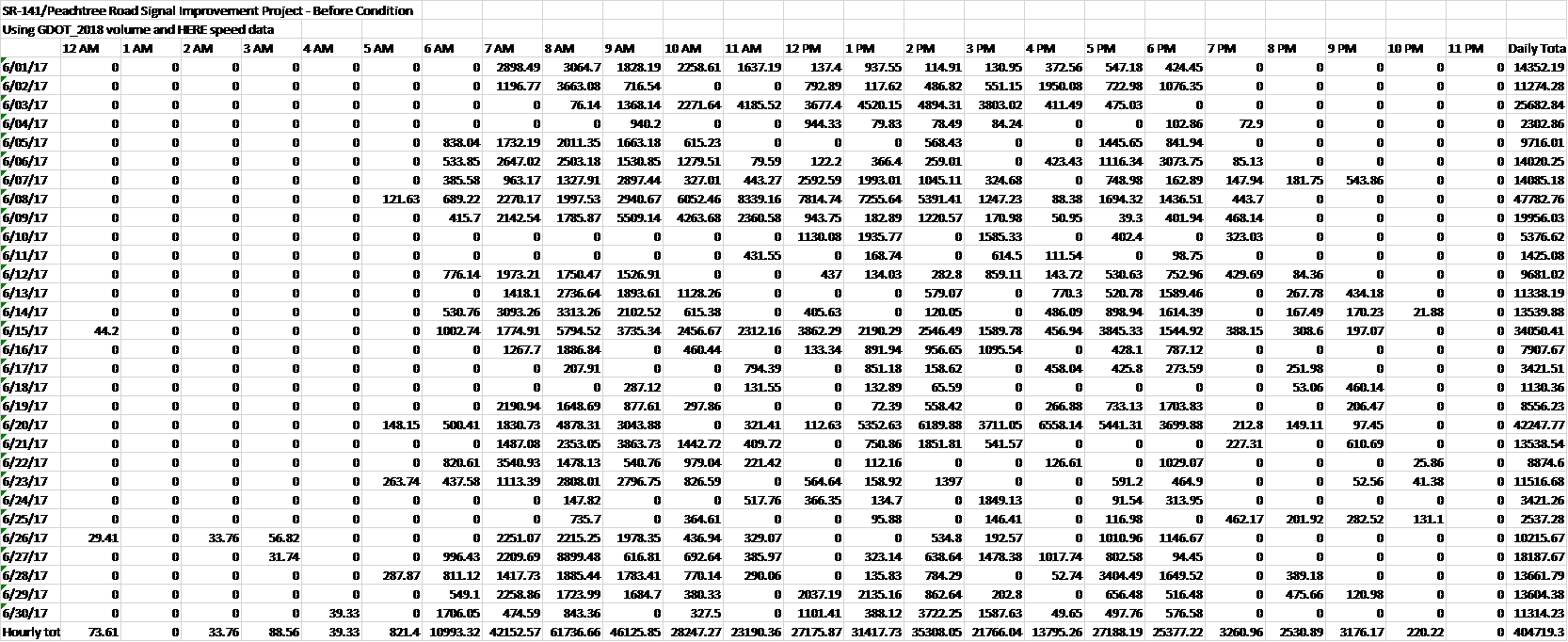
Opening the exported xml file looks something like this
You can make a few simple changes in Excel to the table to make it easier to use, such as highlighting row and column headers, color-coding hourly, daily and grand totals, etc.
Tip
To get clear, simple definitions of each metric, click Save as, then click on the Image radio button and check the box next to 'Include definition of current data type in screenshot'. The definitions for all metrics will then be included in the saved image for your use.
Shown on the left is an example Excel spreadsheet with a heading and data source added and key information highlighted.
Populate the UDC table
Using the User Delay Cost table from the DesignSheets, add in the delay and cost performance information, numerical and percent changes and resulting from the project. Add color-coded indicator arrows to highlight performance changes. You can also create your own graphic or table with information of your choosing.
Copy and paste your finished graphic into your Performance Results report page.