Use this template to create a report that describes the performance of a corridor over a selected time period (quarterly, yearly) and compares that performance with previous periods.
Overview
Click to download the PowerPoint template to create a report that describes the performance of a corridor over the course of a year and compares that performance with previous years. Additional design resources are also available.
Used with PDA Performance Summaries to generate reports.
(Optional) Google Earth Pro
Used to create a background map image.
Design Recommendations To Keep In Mind
We've strived to make the Guides simple and easy to understand, but if you have any questions or need help, please contact us at support@ritis.org. To start off, we think these abbreviated Lessons Learned from FHWA's Performance Reporting Prototype Technical Report are very instructive and important to keep in mind:
Tailor report content and format to engage and inform your audience
Keep reports for the general public engaging and simple
Reserve greater complexity for professional transportation audience
Consider how the audience experiences transportation - the general public typically doesn't care about agency business process silos
Relevant, easy-to-understand graphics are likely to be shared
‟Single issue, single page” graphics-heavy infographics are a valuable tool to draw in a larger audience
Snapshots are not enough
Make sure to include trends and contextual information
Link to actions being taken by the organization
Don't empasize appearance over effectiveness
Information should be conveyed clearly and concisely
Simplicity over embellishment is usually best
Tell a story so the data comes alive
The story must be delivered at the right technical level for the audience and targeted on an area of interest
Tips and Tricks (▶)
Throughout the How-to Guide, you’ll see lightbulb icons and blue arrow bullets. Click on the bulb icon to see tips on using PowerPoint features and functions to help make creating a report faster and better. Blue arrow bullets call out helpful information about building the report using RITIS and/or agency information.
How to Create the Report
Click on each numbered box below to learn how to create the content in each section and how we used RITIS to generate charts and produce performance data.
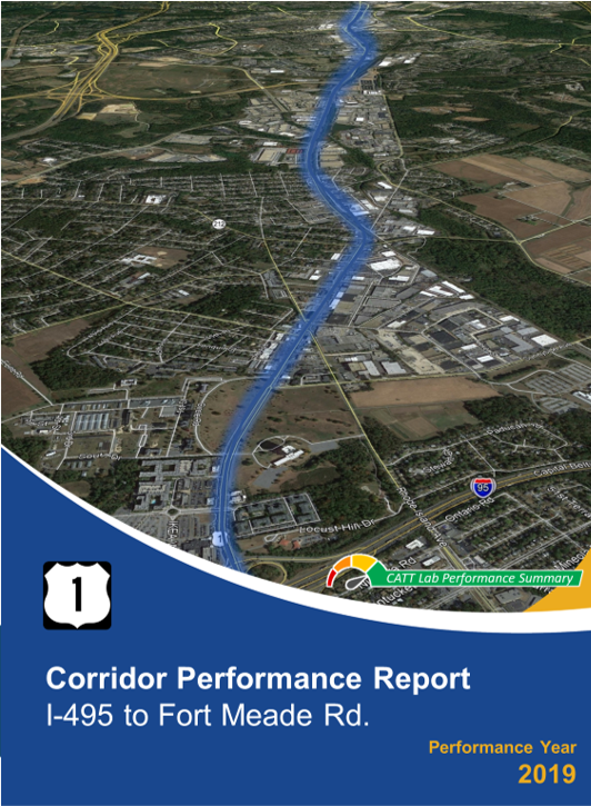
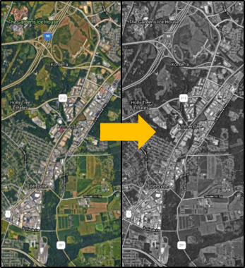
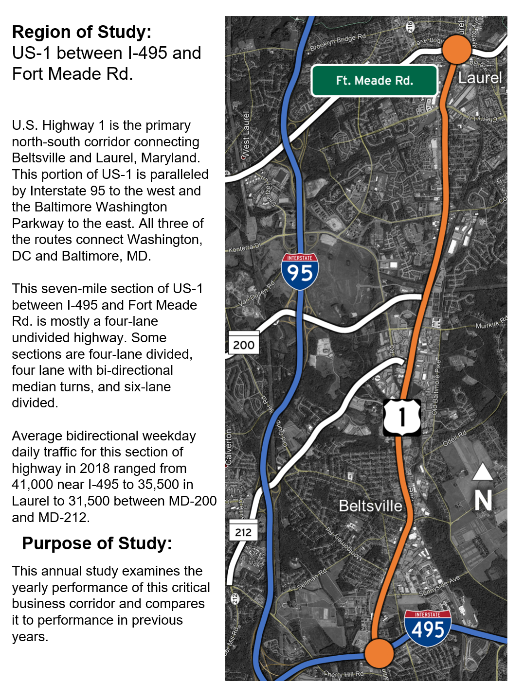
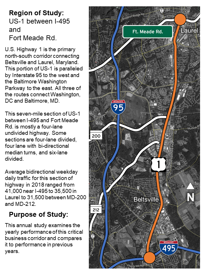
For this report, we're using actual conditions and information for a section of US Route 1 (from I-495 to Meade Road) located in the Washington, DC/Baltimore area.
How to make the cover pages
Select cover page
In Microsoft PowerPoint open the front cover template.
Gather your agency’s logo and some applicable background images to choose from.
Tip
Using high-resolution images will give your report a more professional look. If desired, choose some images that you can use other places in your report, like the back cover, as a supplement to maps, etc.
Another option is to add a background map image with highlights from Google Earth Pro (described below).
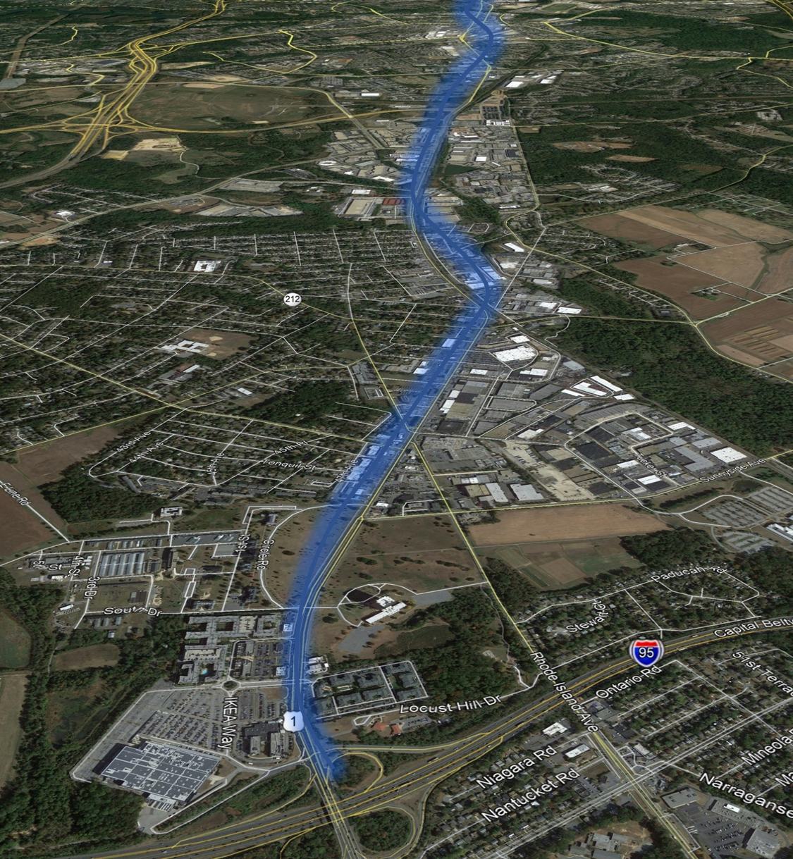
Create background map image
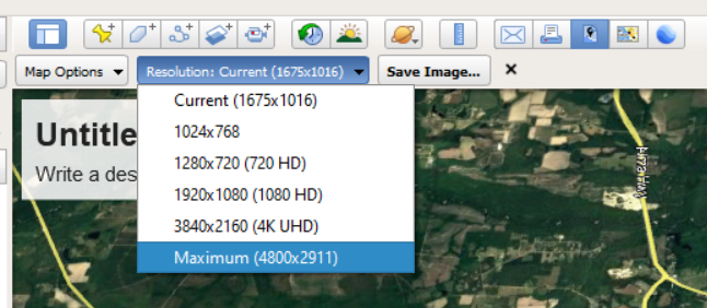
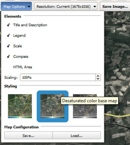
In Google Earth Pro, select the roadway you’re analyzing, then click Map Options, Options.
Tip
This example uses a desaturated color base map that greatly tones down the map color saturation. This allows for better highlighting of the study roadway, making it pop.
Click Resolution and select Maximum.
Save the image as a JPEG, then import into PowerPoint.
Overlay a road highlight
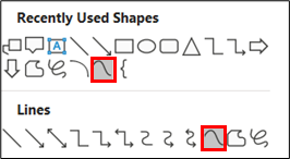
In PowerPoint, select “Curved Line” from the shape menu.
Left-click along the path of the roadway to draw the line. Double-click to end the curve. Right-click the finished line to bring up an edit menu to add or move curve points.
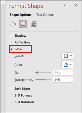
Under Shape Effects, apply Glow. Using the Format Shape dialog, change the color to the same color as the line. Adjust the size and transparency bars to produce the effect based on your personal preferences.
Assemble your cover page
Tip
Clicking on the magnifying glass icon maximizes the size of the image to full screen. Clicking anywhere in that expanded image takes you back to this page.
Copy and paste your image and agency logo into the cover page template.
Right-click on the image and select “Send to Back” from the drop-down menu so the image lays behind the cover graphics and text.
If there’s not enough contrast with the background image, double-click your agency’s logo and select Color from the Adjust ribbon to select a more suitable color.
Edit the Project Name / Description, date and report type placeholders.
You can change the colors of the bottom graphic by double-clicking it and selecting “Color” from the “Picture Format” ribbon.
Create a back cover
For the back cover, simply flip the front cover template, add your agency's logo and pertinent contact info.
How to make the overview page
Select background/summary page
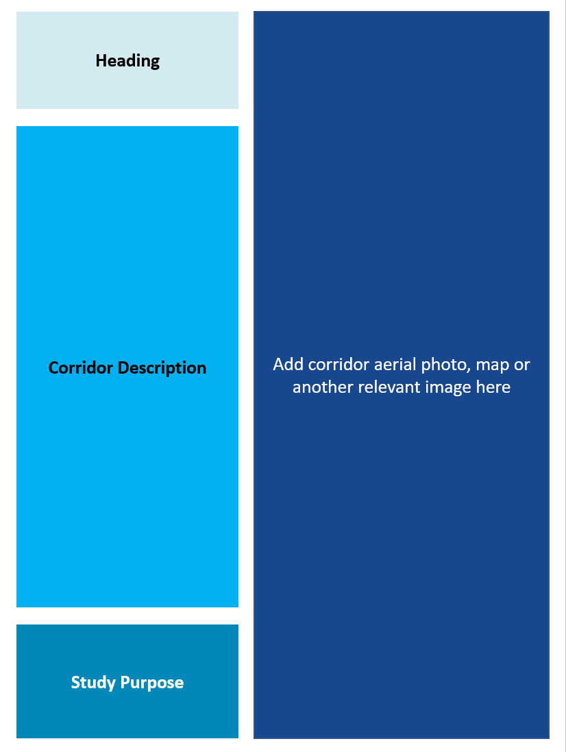
In Microsoft PowerPoint open the Background / Summary page template.
Create a background image
Use the same process as described above for how to make the cover page to select, scale and crop an appropriate image.
To make your desired roads stand out, greyscale the image.
From the Shapes dropdown, "Curve", then left-click along the path of a roadway to draw the line. Right-click the finished line to bring up an edit menu to add or move the curve points for fine-tuning.
Under Shape Effects, apply "Glow". Use a low point size and transparency of 0% to create a contrasting border along the line.
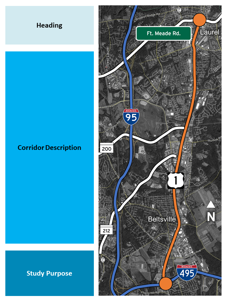
Insert image in the overview page template
Apply highlights in different colors to other significant roads according to your preferences.
Add road shields and road names.
For customized route shields — such as SR 200 and 212 — use PowerPoint drawing tools along with the Interstate font.
Add a north arrow, or any other annotations, texts or highlights that will help give the reader important location map information.
Add text and any finishing touches to the project overview page
Add a Heading describing the study route, limits, Township, County, etc.
Add a Corridor Description that describes the road and environs — location, length, number of lanes, daily or peak volume, geographic context, etc.
Finally, add a Study Purpose that lays out the focus and importance of analyzing the corridor.
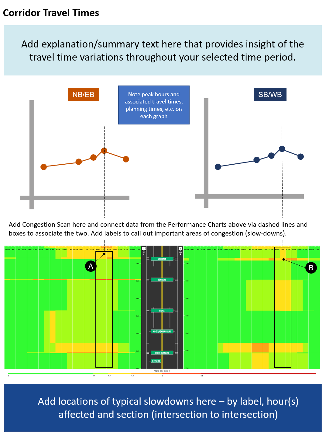
How to make the hourly travel time graph
Select the travel time/heat index page
In Microsoft PowerPoint open the Travel Time/Heat Index page template.
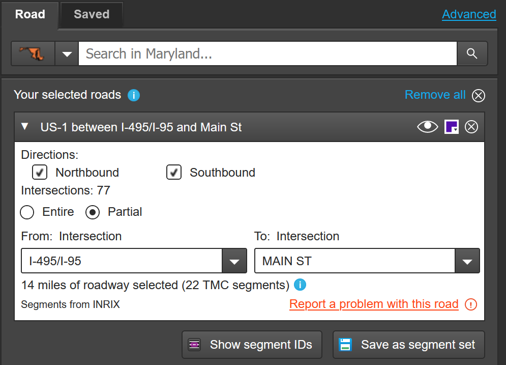
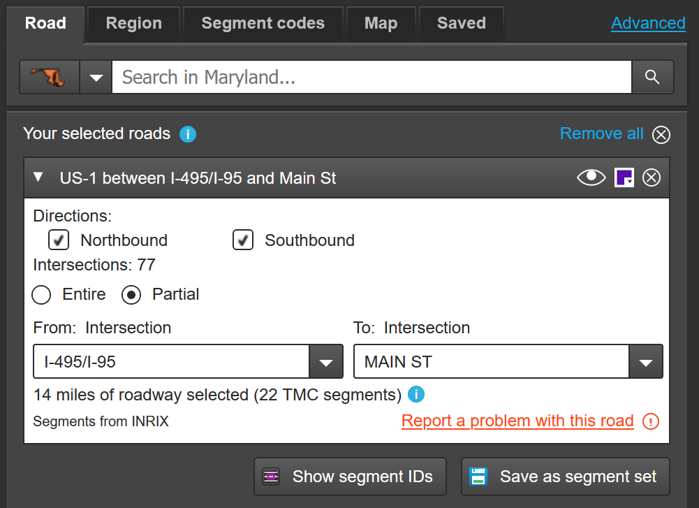
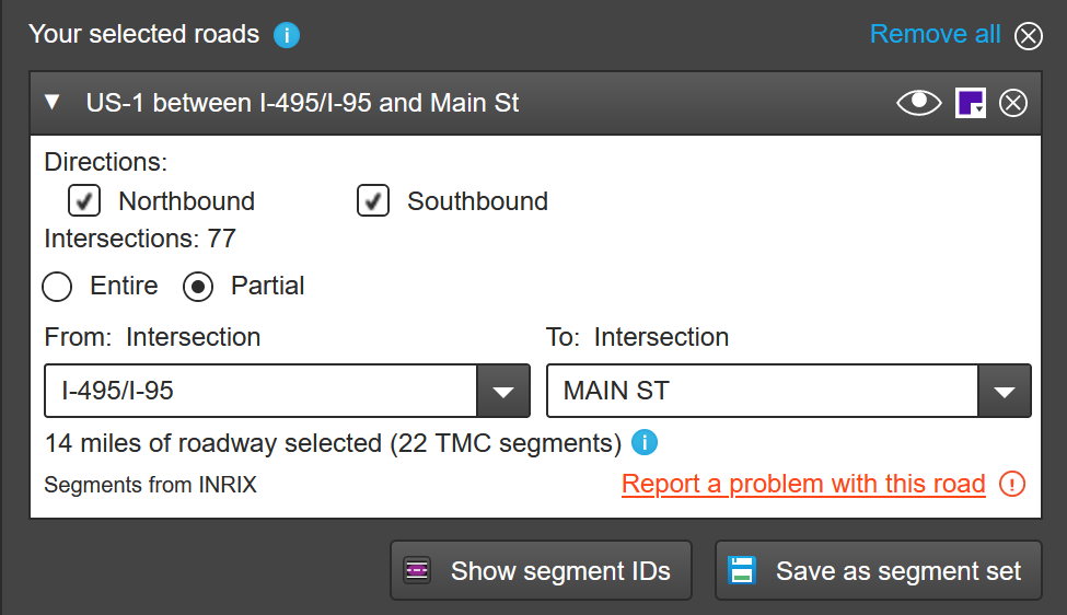
Under Select roads, enter your state and a road name. A list will appear. Click on the appropriate choice, then to query a smaller segment, click on Partial, then use the From: and To: intersection dropdowns to focus on your analysis segment.
Tip
Use the Save as segment set button to save your selected road(s) for later analysis with any PDA tools. Then, just click on the Saved tab at the top instead of searching for a road, find your road and click it.
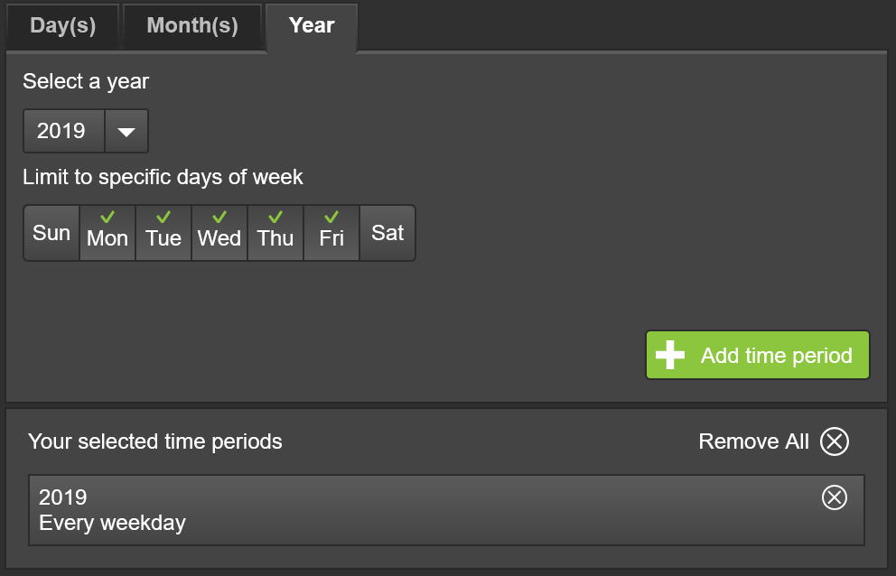
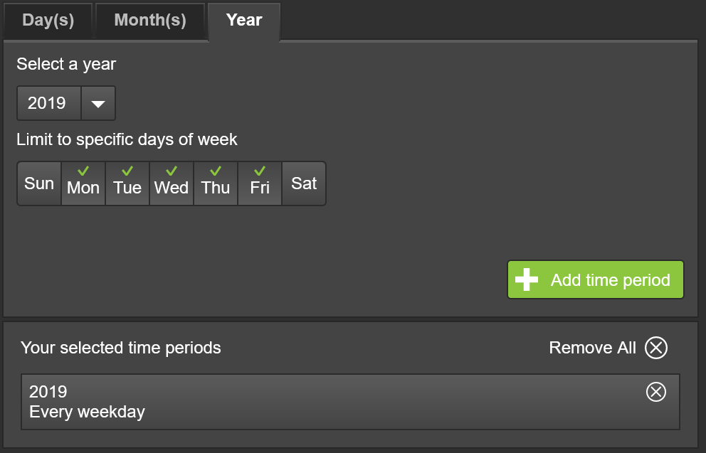
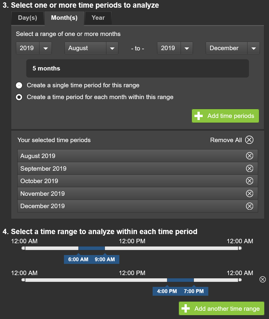
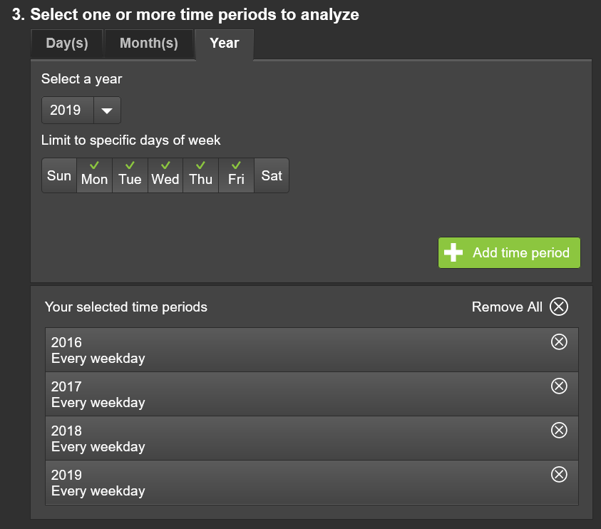
Next, use Select one or more time periods to choose specific days, months, or year to analyze. Choose the specific days of the week by checking or unchecking the days, then add the time period by clicking on the Add time period button.
Tip
You can add multiple time periods to your query for creating a chart for each pair of periods and time ranges by clicking on the Add time period button.
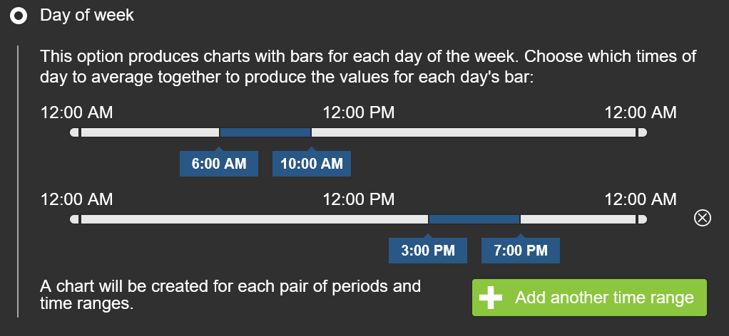
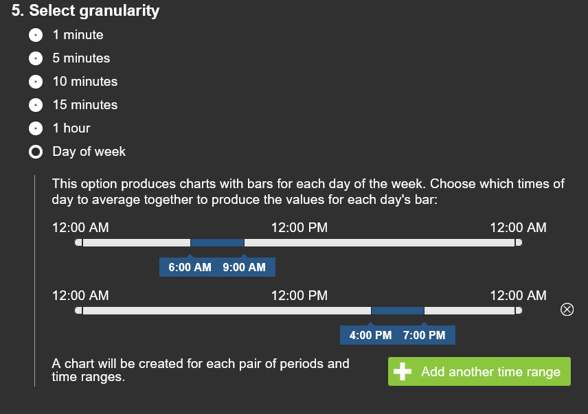
Select a time range to analyze within each time period. Here you can specify peak hours or periods of interest.
Tip
You can add multiple hour ranges to your query for creating a chart for each pair of periods and time ranges by clicking on the Add another time range button.
Next, select a data source (INRIX, HERE or TomTom or various NPMRDS datasets).
Finally, click the Submit button.
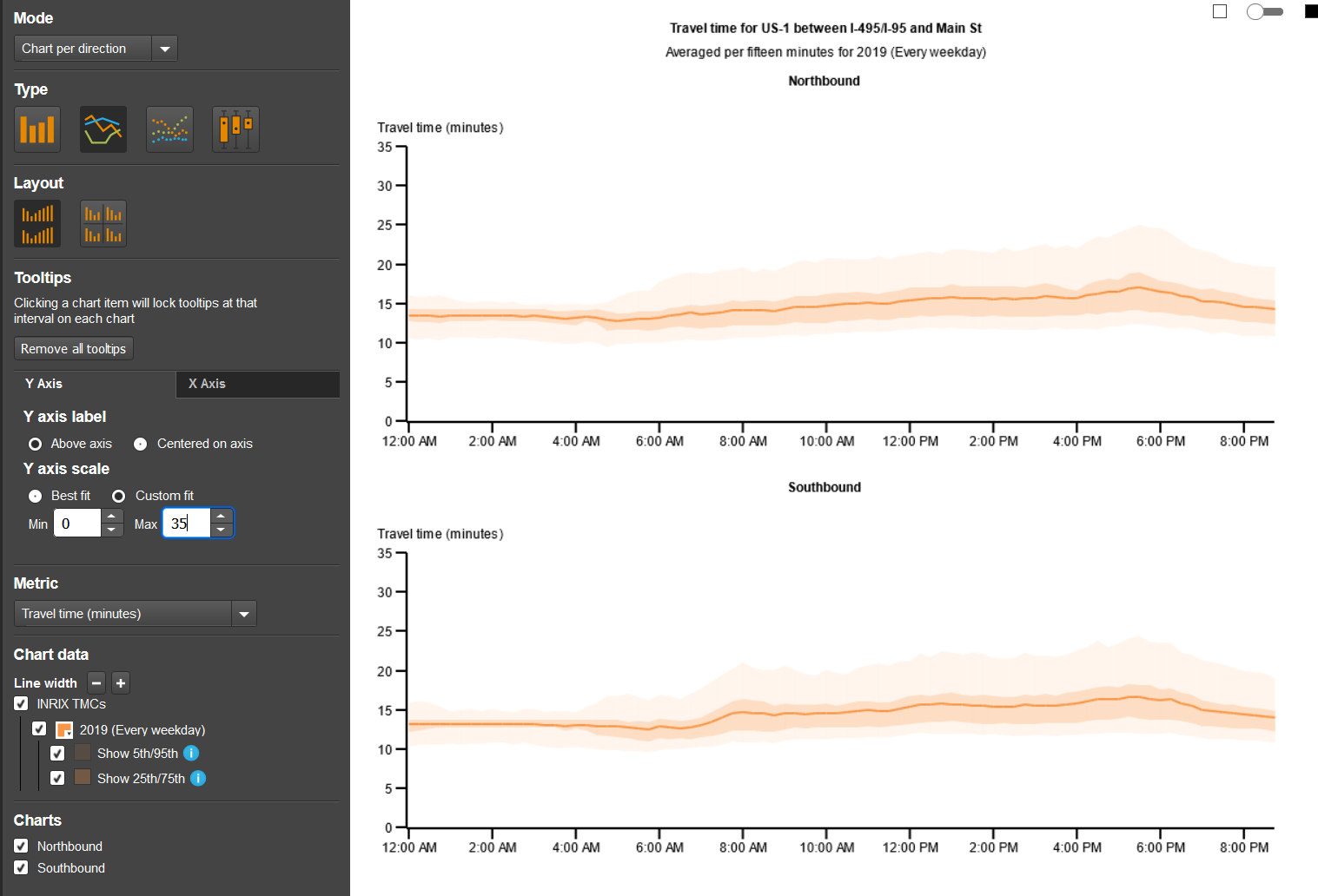
Tailor the chart results
Tailor the chart results by selecting, deselecting or editing:
Mode (chart by direction or time period)
Type (column, line, plot, candlestick)
Layout (vertical, tile)
X/Y axis (full range customization)
Metric (11 choices)
Chart data (line width, data line color options and % ranges appearance)
Charts (view one or both roadway directions)
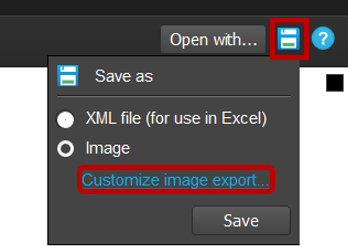
Save your charts using "Customize Image Export..."
Click on the Save as icon.
You can save the chart data as an XML file, for further analysis using Excel, or save as an image for inserting into a report.
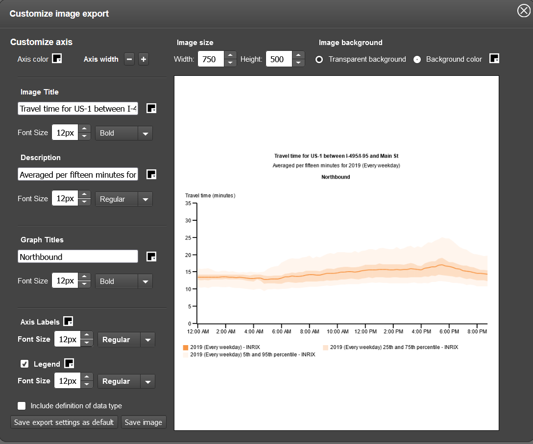
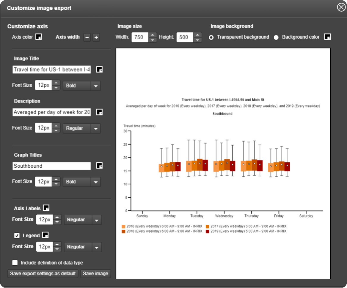
Clicking on the Customize image export brings up a customization popup for editing various aspects of the chart:
Axes (color, width)
Image (size & background color)
Tip
Change the image size to improve legibility at the scale you will be utilizing.
Graph Titles (labels, font sizes & type)
Include definition of data type if desired by checking the box
Click Save export settings as default (if desired) then click Save image.
Your image will be automatically downloaded.
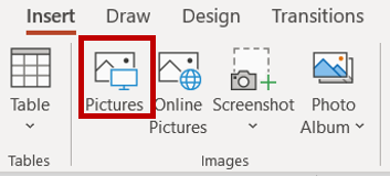
Insert the final image into your document
In PowerPoint, insert the image into the document using the "Picture" button on the "Images" toolbar.
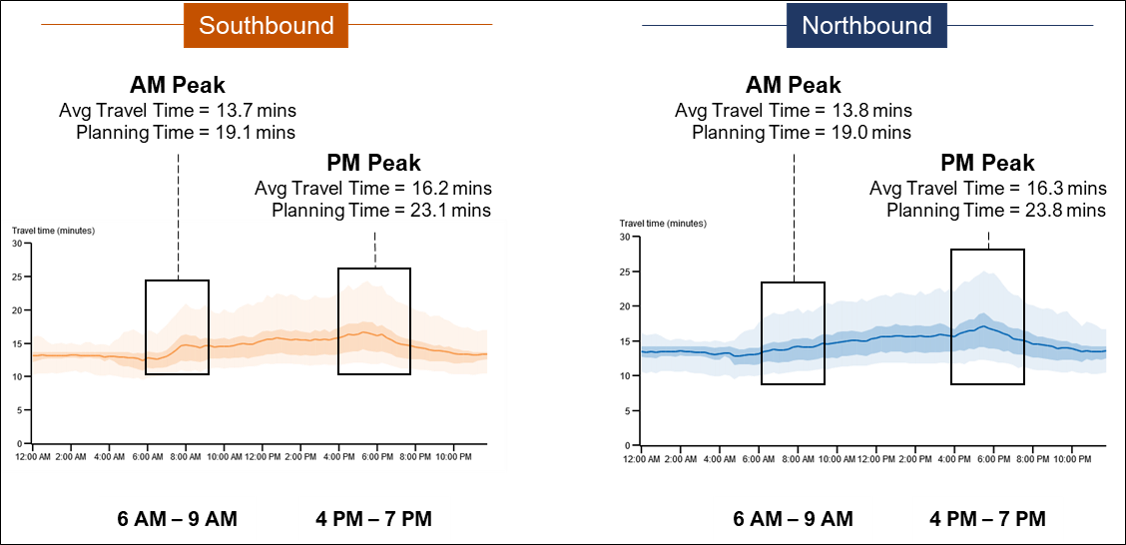
Apply some finishing touches
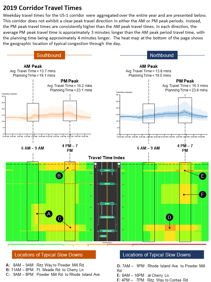
In PowerPoint, align the Southbound and Northbound graphs side-by-side and label them.
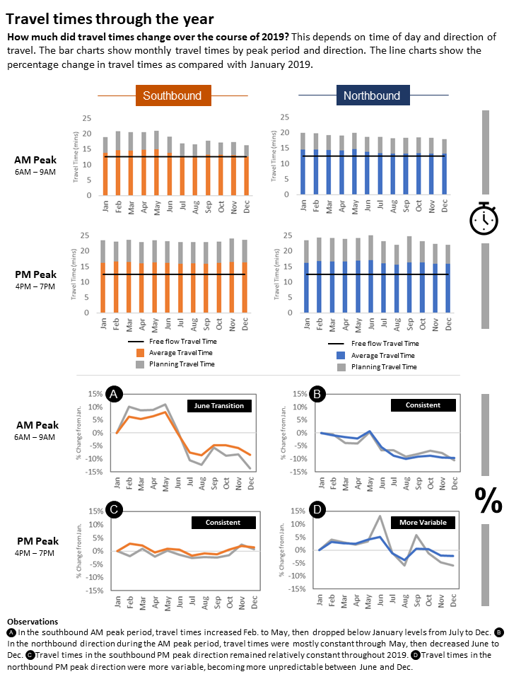
Draw callout boxes for each graph that highlight the AM and PM peaks, and using results from PDA, annotate the boxes with specific data results.
Add the AM and PM peak period times at the bottom of the graph.
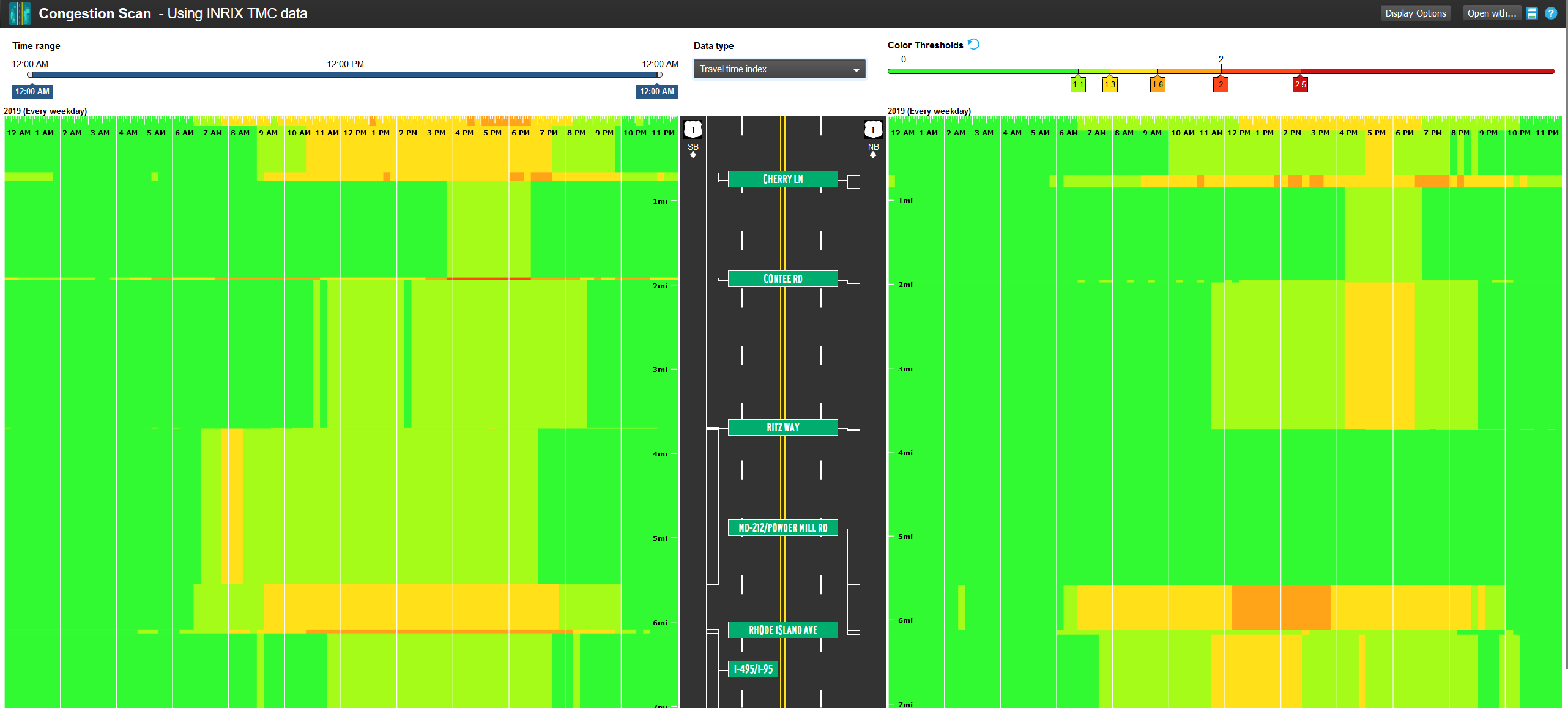
In the Congestion Scan query screen, use the same parameters as you did with Performance Charts.
Tip
You can open Congestion Scan results from the previous Performance Charts results simply by clicking the Open with... button and selecting Congestion Scan.
Your results screen will look like this
Make the following changes to the Use PDA Congestion Scan results:
Use the full 12AM to 12AM time range (shown)
Select "Travel Time Index" as the data type
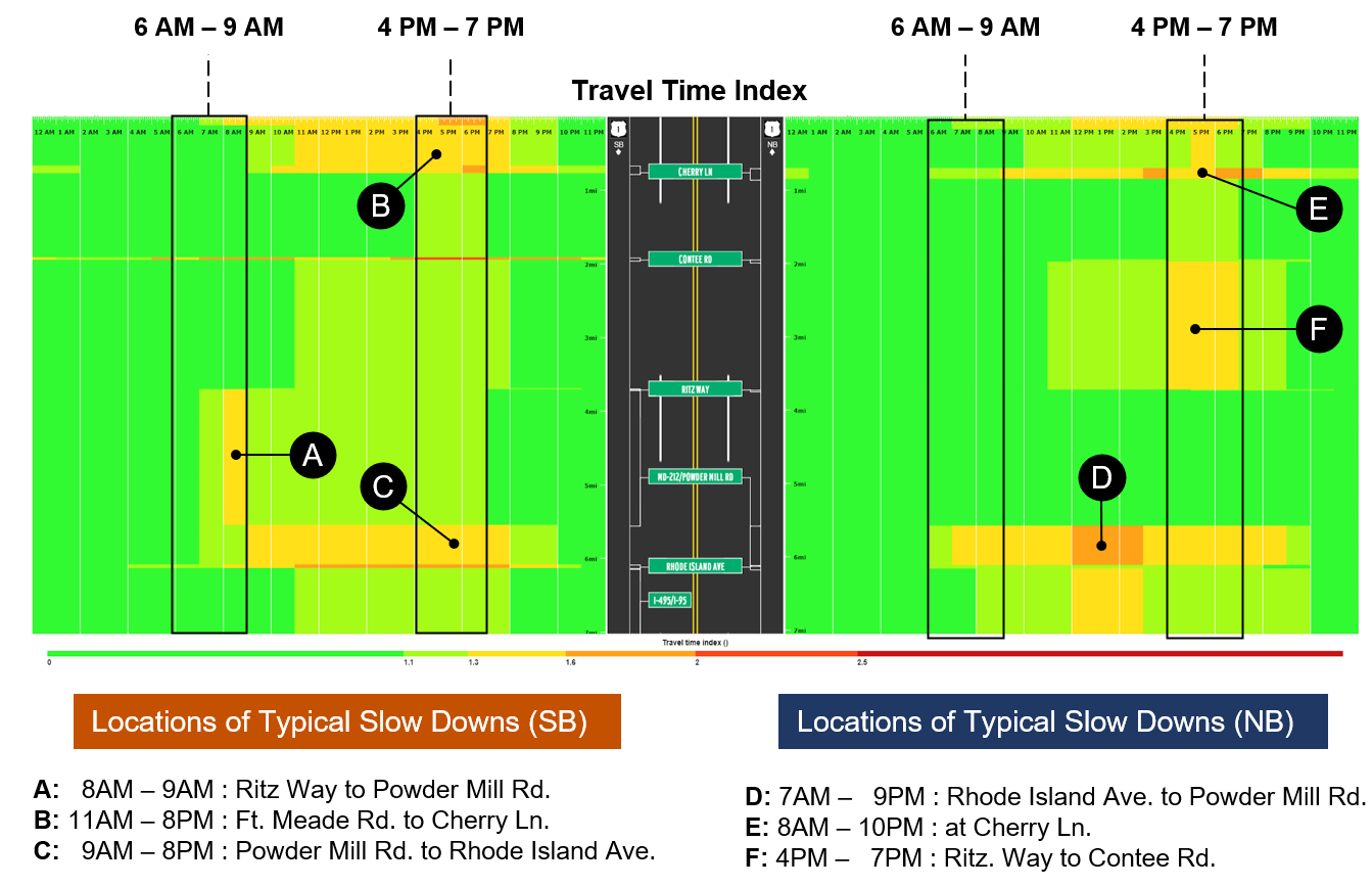
Add some finishing touches
In PowerPoint, align the Congestion Scan results directly underneath the travel time charts so that the timelines match
Use callouts to highlight locations of typical slowdowns for each direction
Add some detail at the bottom denoting where those slowdowns are occurring
Align the Performance Chart results and Congestion Scan results for a "multi-view look" of conditions for the peak periods
Add a discussion at the top that summarizes the important changes to the roadway from the preceding analyses
How to make the travel time column charts
Select the travel time column/travel time % differential page
In Microsoft PowerPoint open the Travel Time Column/Travel Time % Differential page template.
Under Select roads, enter your state and a road name. A list will appear. Click on the appropriate choice, then to query a smaller segment, click on Partial, then use the From: and To: intersection dropdowns to focus on your analysis segment.
Tip
Use the Save as segment set button to save your selected road(s) for later analysis with any PDA tools. Then, just click on the Saved tab at the top instead of searching for a road, find your road and click it.
Next, use Select one or more time periods to choose specific days, months, or year for your analysis. You can create a single time period for your range, or in this case, create a time period for each month with the specified range.
Tip
You can add multiple time periods to your query for creating a chart for each pair of periods and time ranges by clicking on the Add time period button.
Select a time range to analyze within each time period by using the time sliders and hour or hour range. You can click on the Add another time range button to add more ranges.
Tip
You can add multiple hour ranges to your query for creating a chart for each pair of periods and time ranges by clicking on the Add another time range button.
Finally select INRIX as the data source, then click the Submit button.
Create a new Microsoft Excel workbook
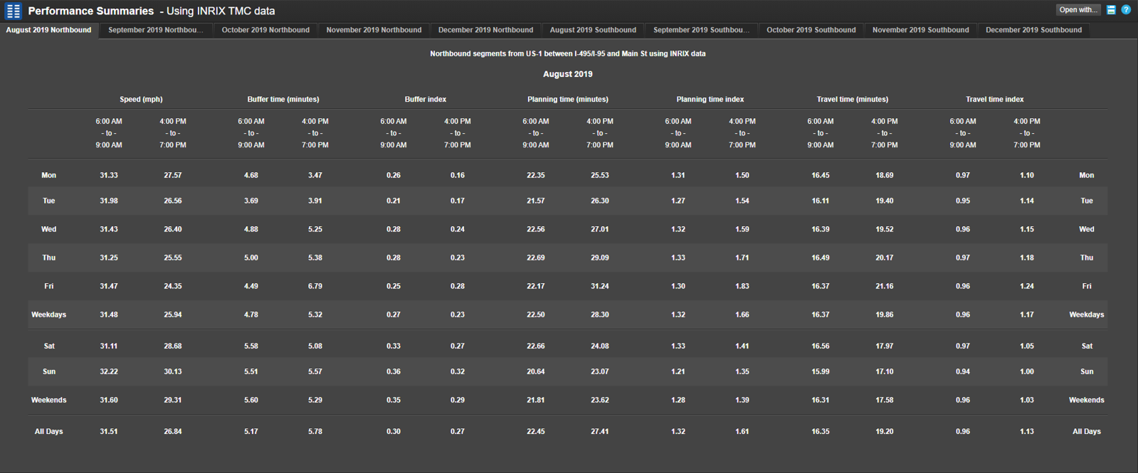
Enter selected data from performance summary into the Excel workbook
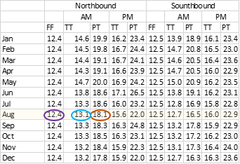
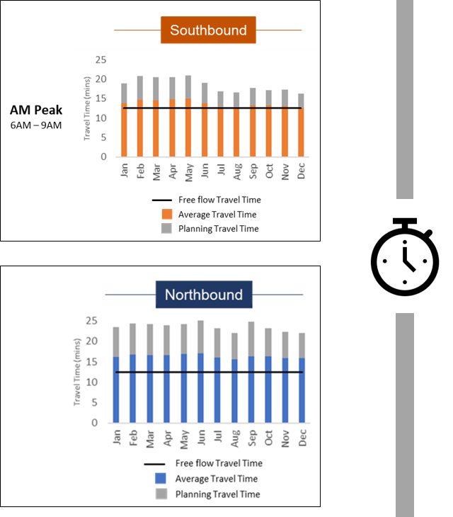
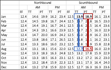
Using the Performance Summaries results, select the measure/timeframe results of interest — in this case, Travel Time and Planning Time for August 2019 Weekdays, 4:00 PM to 7:00 PM
Manually enter values into offline Excel spreadsheet
Estimate free flow travel time — in this case, 12.4 minutes — which is the typical 25th percentile travel time shown on the hourly travel time chart (determined by inspection)
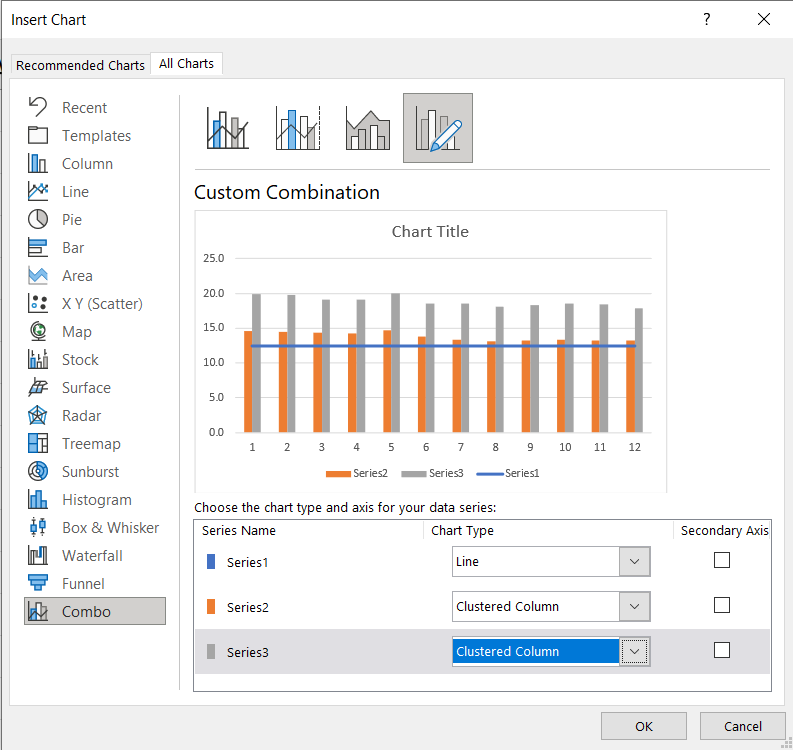
Create a combination chart
In your Excel workbook, highlight your data and select Insert, Recommended Charts, All Charts, Combo Chart.
Change the chart type for your data series to Line (| Series 1) and Clustered Column (| Series 2) and Clustered Column (| Series 3)
Click OK
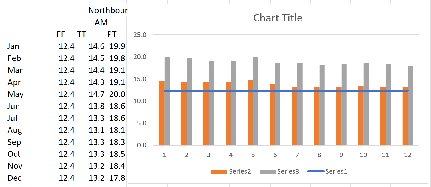
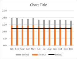
Your resulting chart (highlighted workbook shown) will look like this.
Now some basic editing to the chart to finalize it.
Label the horizontal axis by month
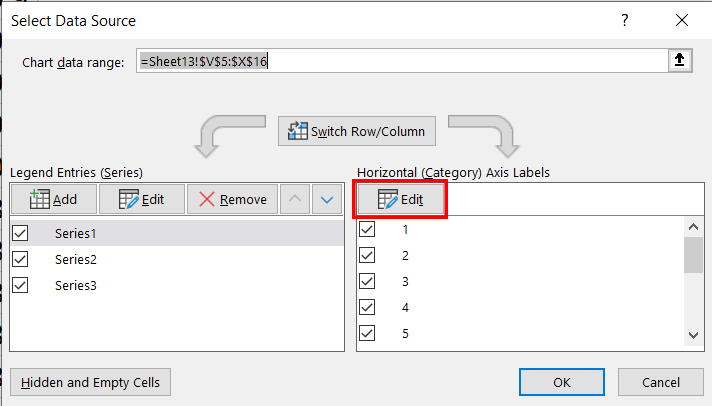
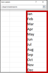
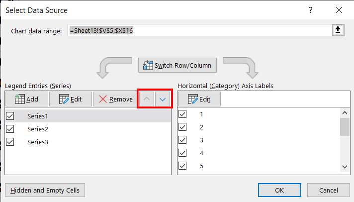
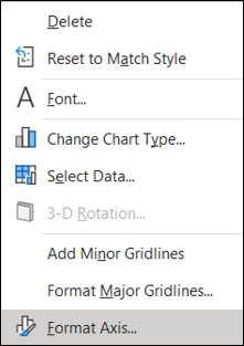
Right click on a column and pick "Select Data..."
Edit the horizontal axis labels
Highlight the month range in your Excel workbook, press enter, and then OK.
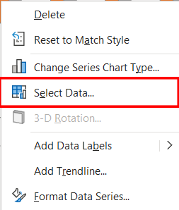
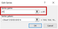
Name each data series
Right click on a column and pick "Select Data..."
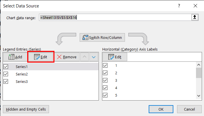
Edit the Legend Entries (Series)
Under Edit Series, click the cell in the Excel worksheet that contains the corresponding category. Repeat for all three series.
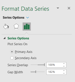
Under Format Data Series, use Series Options to overlap the data columns. (Change the series order if the planning time column obscures the travel time column.)
The chart is now ready to get some final touches, then placed in the report.
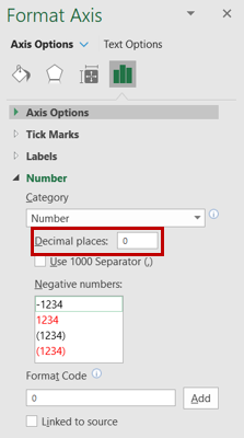
Adding some final touches
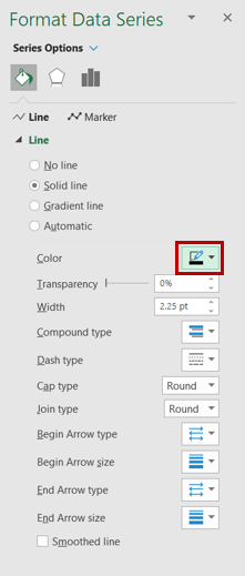
With Format Data Series selected, click on the line and change color as desired.
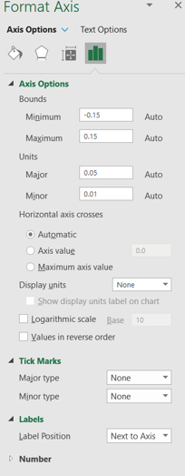
Right-click on the y-axis numbers and select "Format Axis..."
Left-click on chart title and press delete (since titles will be manually added to the overall page).
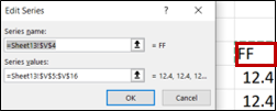
Using the Edit Series menu, change "Series name" to something more descriptive.
Adding some final touches
Here's what a final chart looks like. If you want, add a graphic to help call out that the data is Travel Time-based.
Do the same for the Southbound PM Peak and Northbound AM & PM Peak data.
Add a sidebar graphic to denote that this is a travel time performance result.
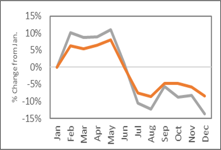
How to make the travel time % difference charts
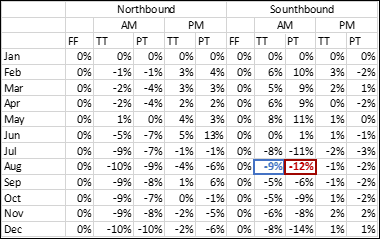
Use MS Excel to create a new % difference spreadsheet from your original
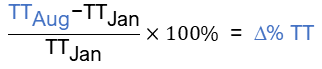
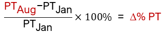
Using the original spreadsheet with travel time and planning time data, create a new spreadsheet for the change in % of travel time and planning time using these formulas:
Clean up the axes and labels
Y-axis options
X-axis options
Set the bounds of the y-axis to be consistent between your charts to allow easy comparison.
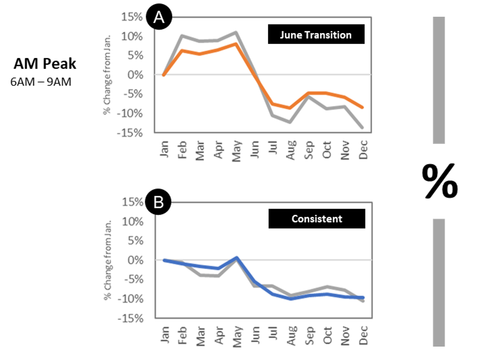
Do the same for the Southbound PM Peak and Northbound AM & PM Peak data.
Add a sidebar graphic to denote that this is a travel time performance result.
Add some finishing touches
Include a reference letter for keying to an Observation section that summarizes and gives meaning to the performance changes in the charts.
Add a call out box in the corner that provides a one- or two-word summary of a specific highlight or the overall meaning of the chart.
Finally, add a sidebar graphic to denote that this is a % travel time differential result.
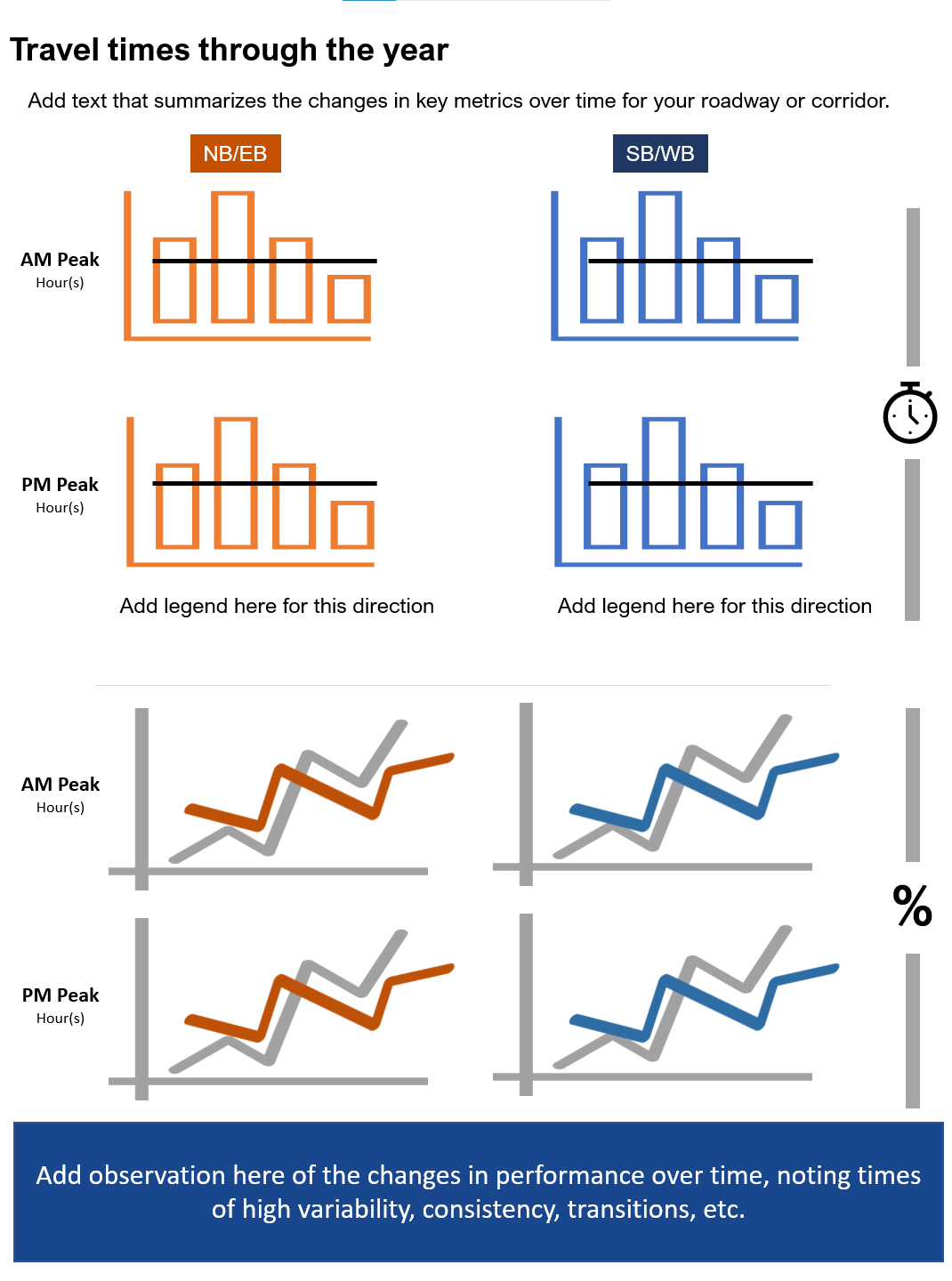
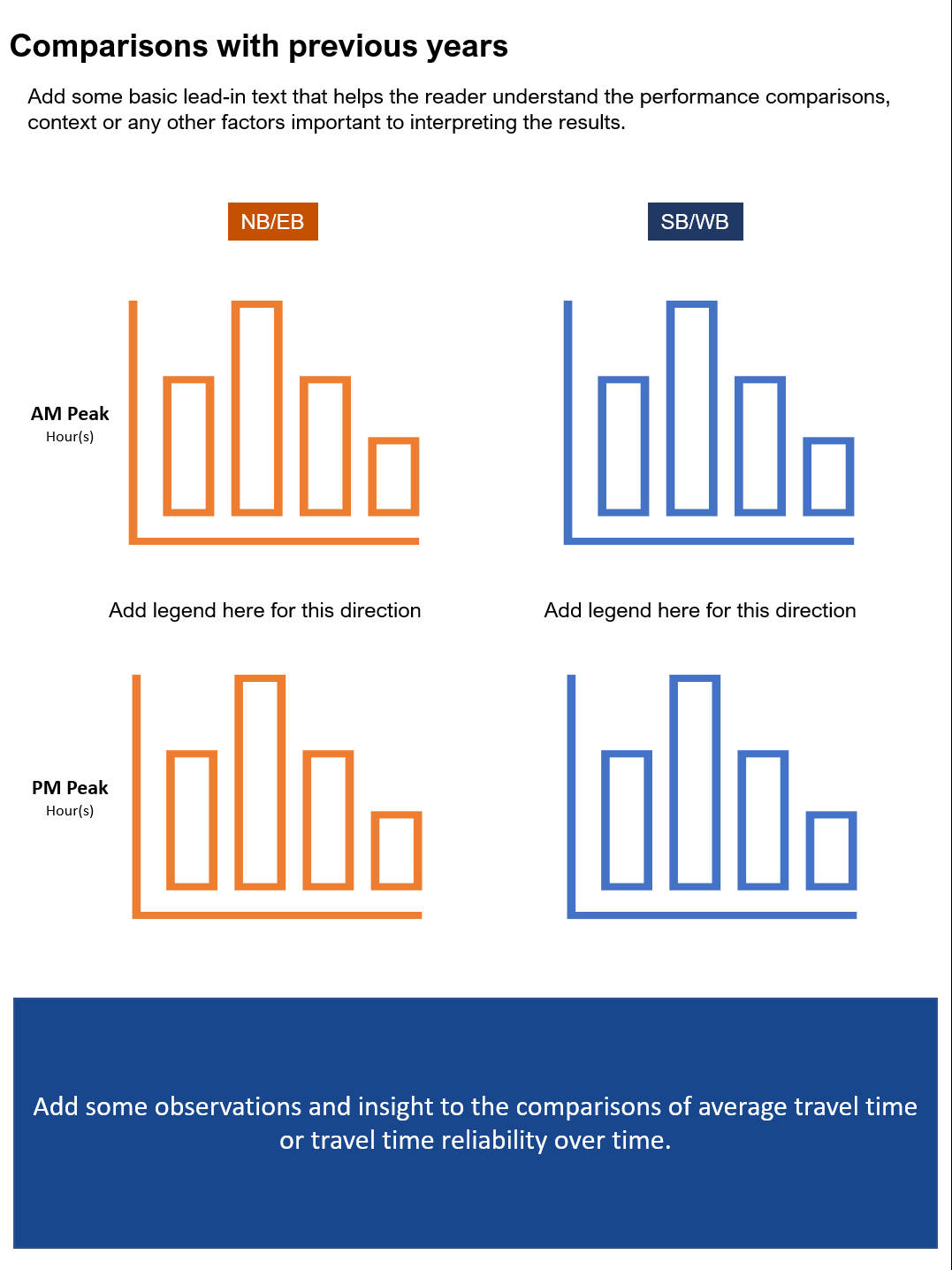
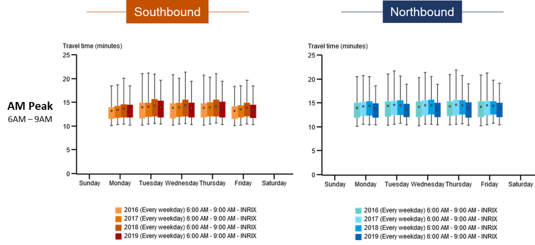
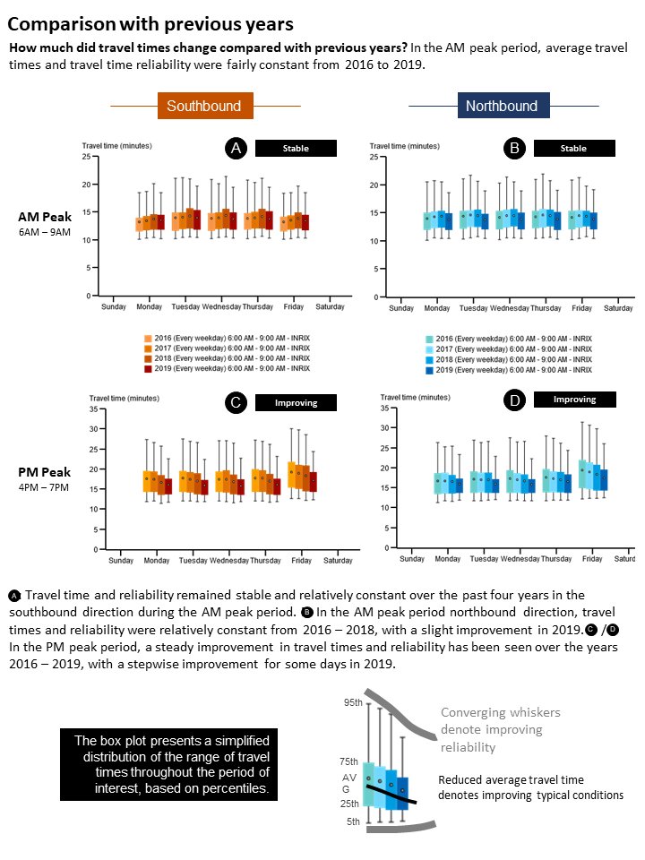
How to make the yearly travel time comparison chart
Select the yearly travel time comparison page
In Microsoft PowerPoint open the yearly travel time comparison page template.
If you saved your TMC set, you can more quickly select your analysis roadway section by clicking on the "Saved" tab under Select Roads, then either filter by your name or start typing the name of the set in the dialog box.
Using the TMC set for your selected roadway, select the Year tab from the time periods to analyze dialog box.
Select a year (in this case, 2016 through 2019), choose what days of the week (weekdays only), then add each time period to your query.
Under Granularity, select Day of week, then using the sliders define the AM Peak (6 AM to 9 AM) and PM Peak (4 PM to 7 PM) periods.
Finally, click Submit.
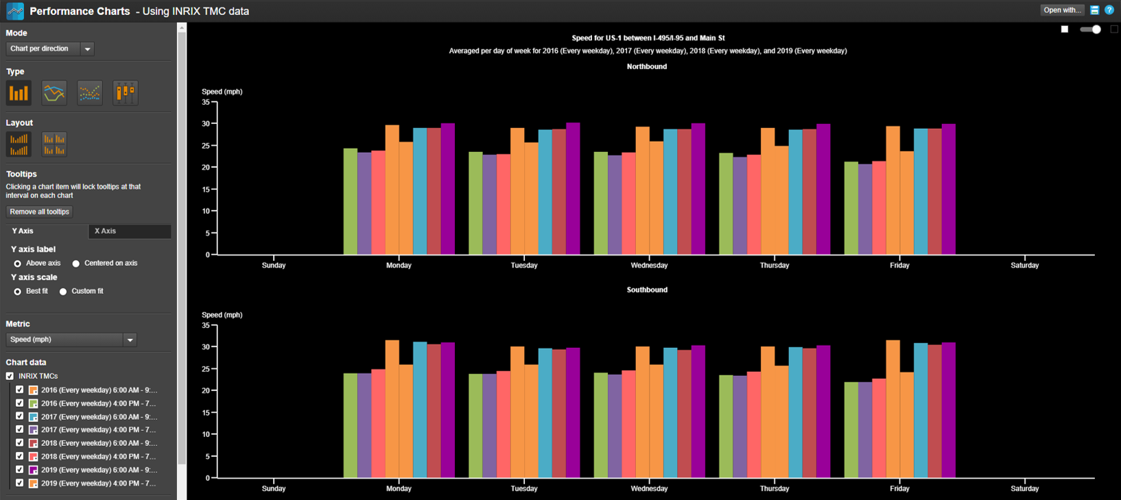
Customize your performance chart
Your initial performance chart will look like this.
Take the following steps to modify your chart into its final form:
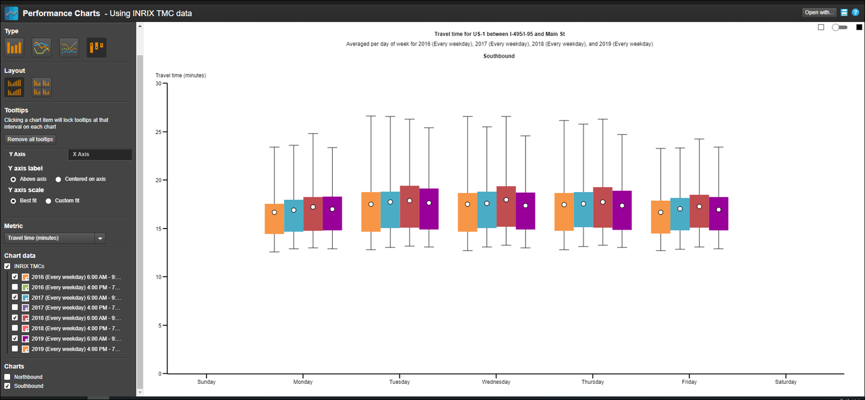
Change the background from dark to light, using the slider in the upper right-hand corner
Change the chart type from column to candlestick by clicking on the candlestick icon
On the Metric dropdown, select Travel time (minutes)
To view just AM peak hour conditions, uncheck every other box shown under Chart data
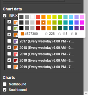
Click on the color palette icon under Chart data to change the colors
Deselect the Northbound checkbox at the bottom of the report settings box, for doing single images of each final chart
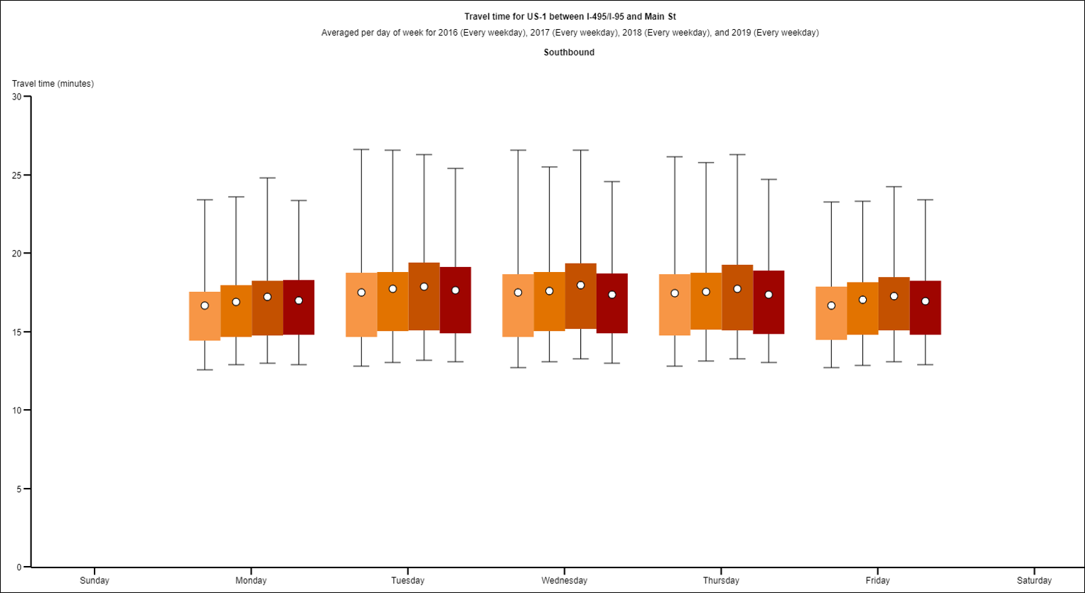
The chart is ready to be saved. Click on the save icon in the upper right hand corner and click Image. You can save your chart as-is or customize it further by clicking on the "Customize image export..." link.
The Customize image export dialog box allows image export settings to be adjusted for things like image size, background color, title, description, axis labels and more.
Repeat this process for each direction, and for each AM and PM peak periods. Change the color palette of the PM condition for better contrast with the AM condition.
Adding some finishing touches
Value add your charts, with color-coded banners, peak hour call-outs, legends and so on.
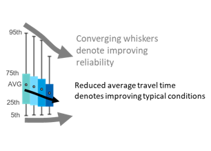
To help explain the usefulness of the candlesticks (travel time changes and percentile travel time changes), include a simple graphic like this one.